banner

Moo Free Chocolate Packaging Design

Brief

The Brief.

ClearBrand have been working with MOO FREE to create a consistent set of packaging, along with new products, seasonal ranges and exhibitions for the last few years.

We had the brief of working to incorporate the brand’s illustration style, along with their playful characters, into updated packaging. We also worked on sub-branding for ranges such as ‘choccy chums’ (final image) for certain product ranges.

Moo Free Selection of Seven Chocolate Packaging designs
Moo Free Chocolate Packaging Design

Solution

The Solution.

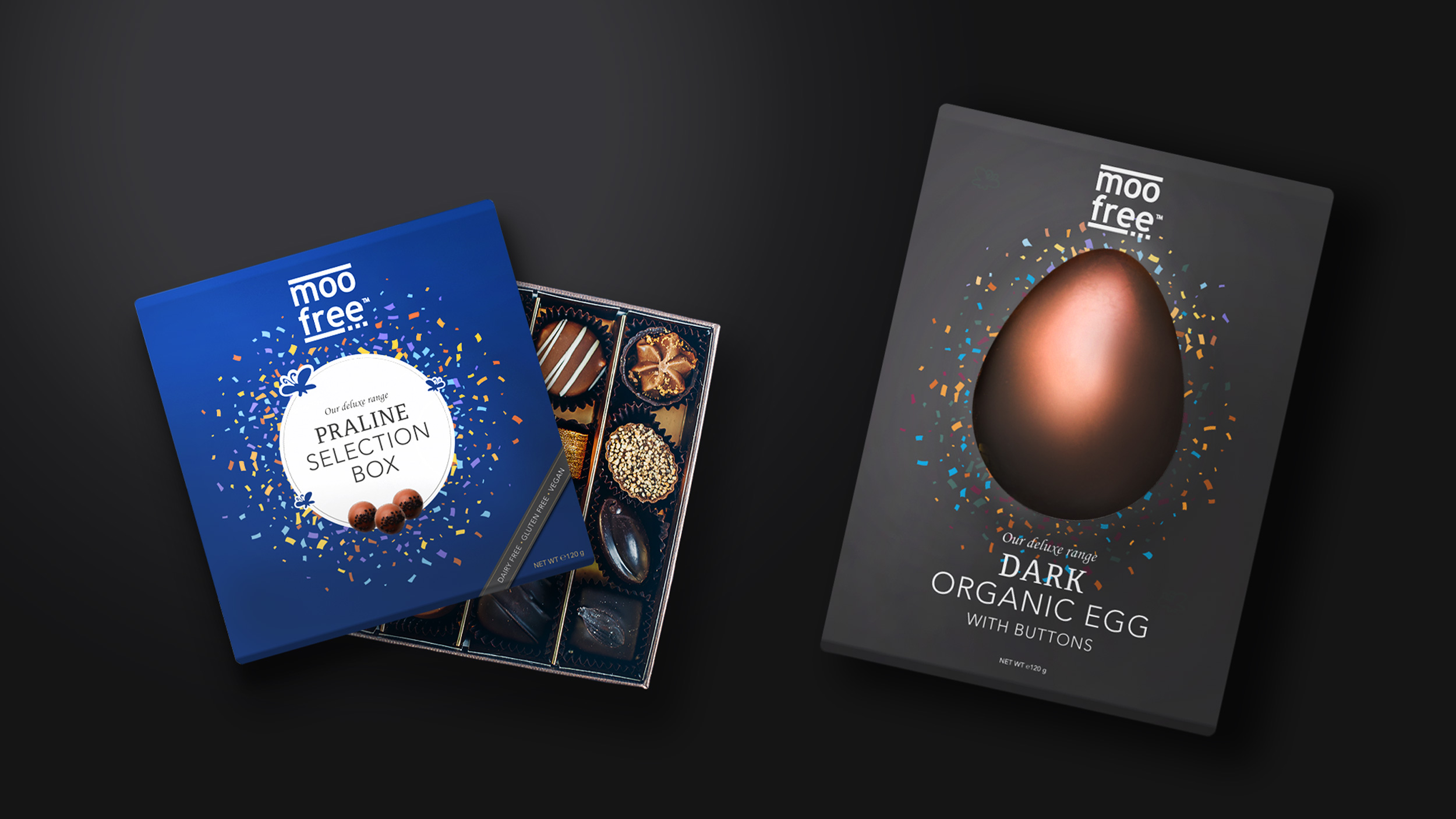
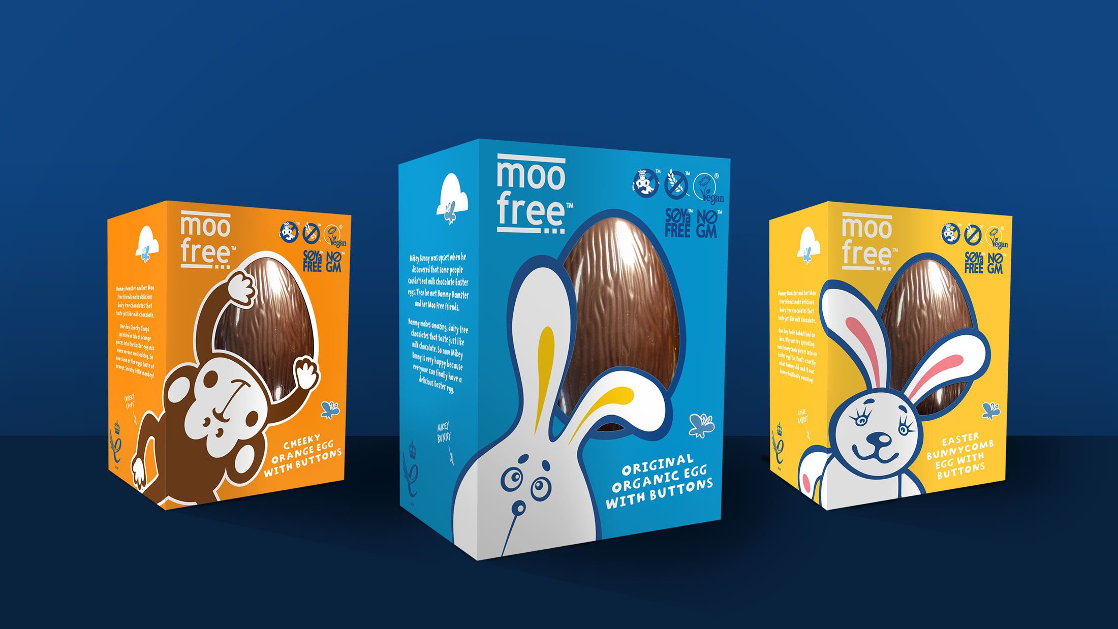
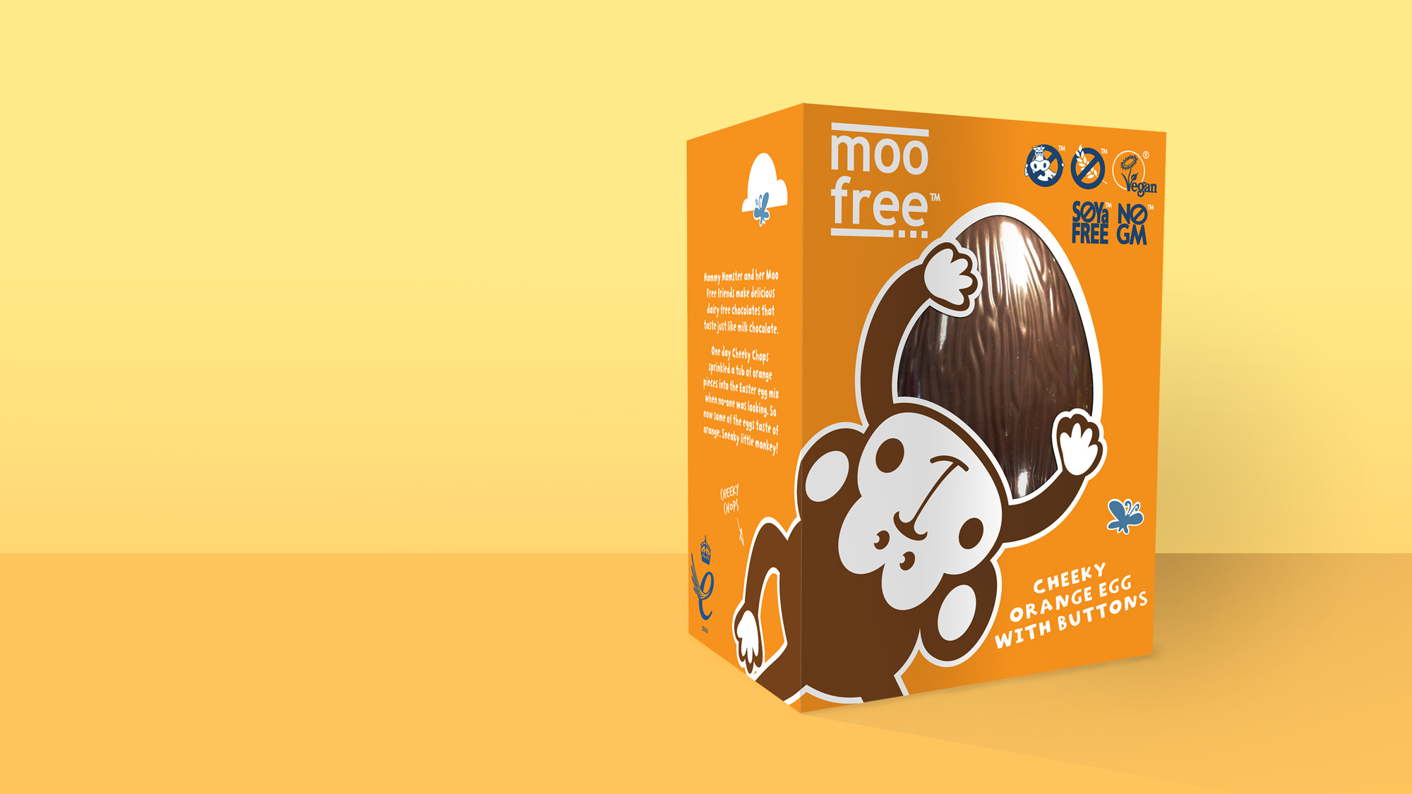
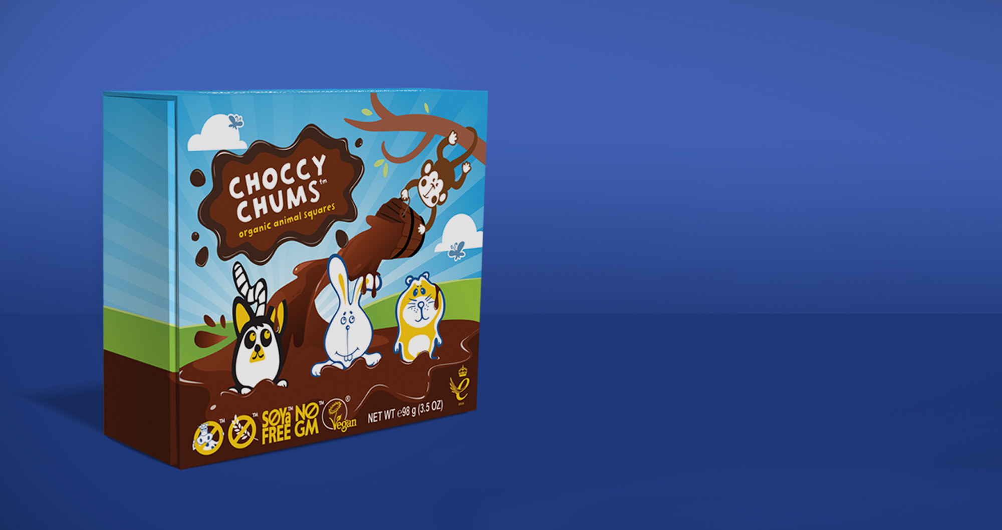
The main challenge for ClearBrand was the differences between Moo Free’s product ranges. They mostly sell towards a younger market with their main range, but then also cater for the adult market with their luxury range.

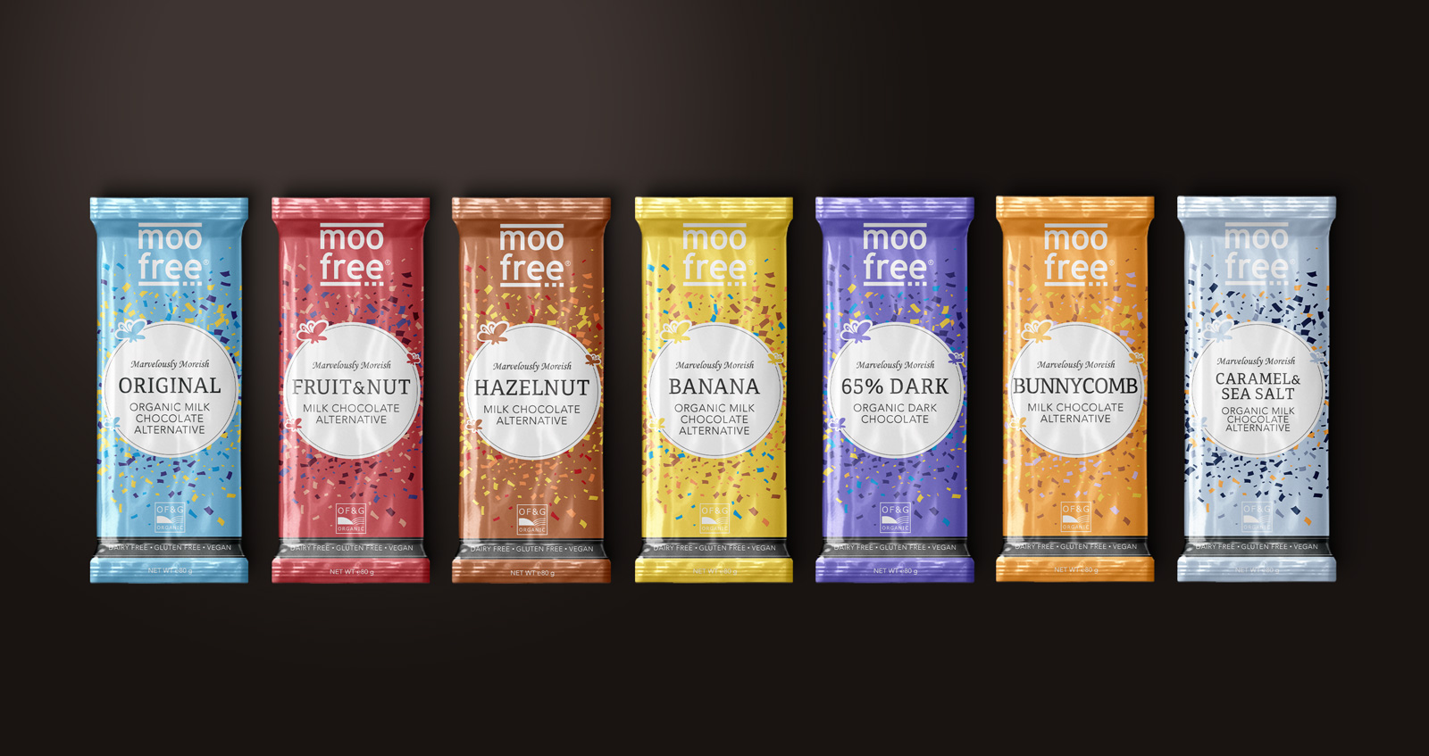
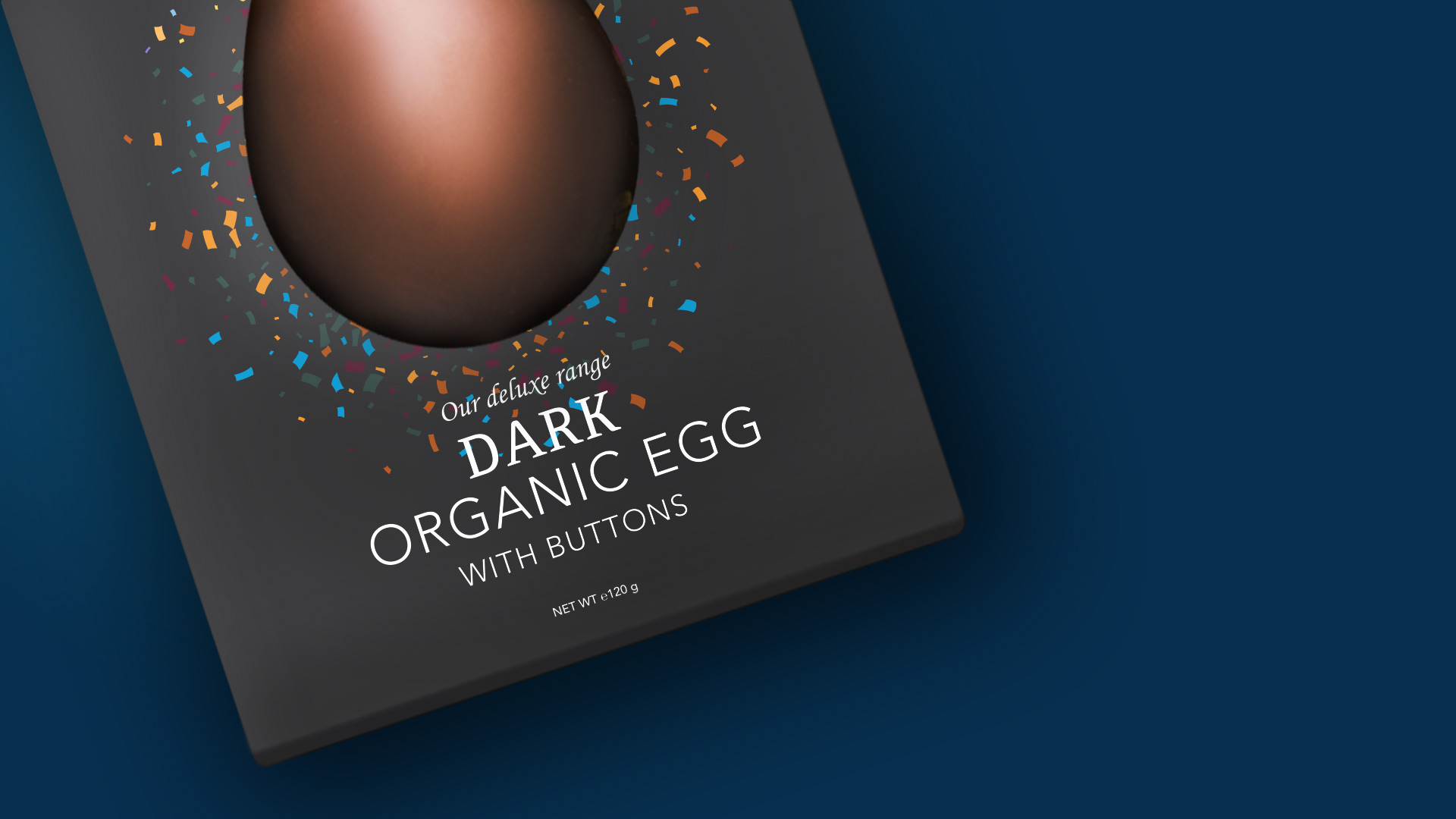
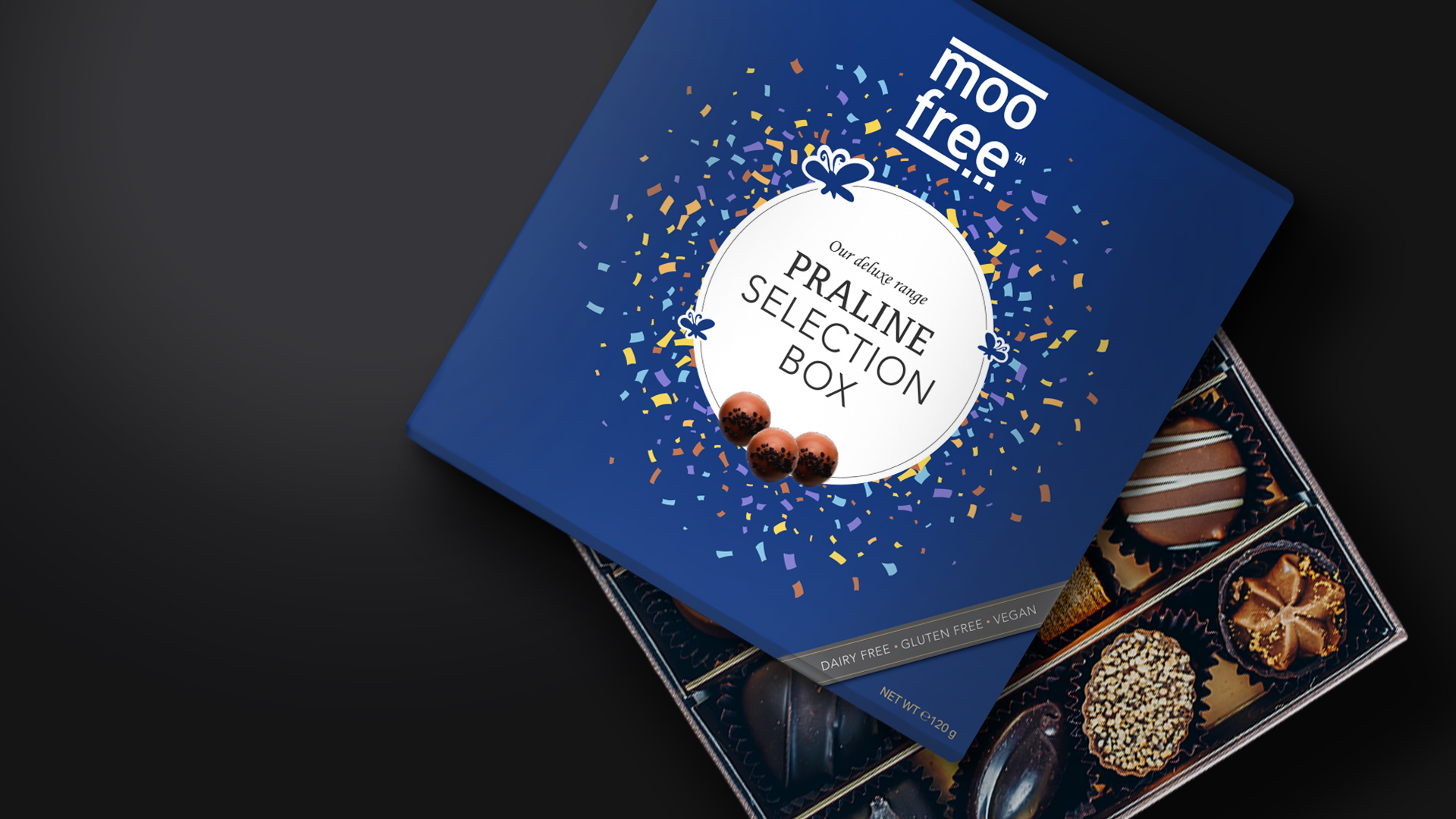
We decided to keep a playful story-telling approach using the characters for the main range and for the luxury range concept designs we took a simpler minimal approach.

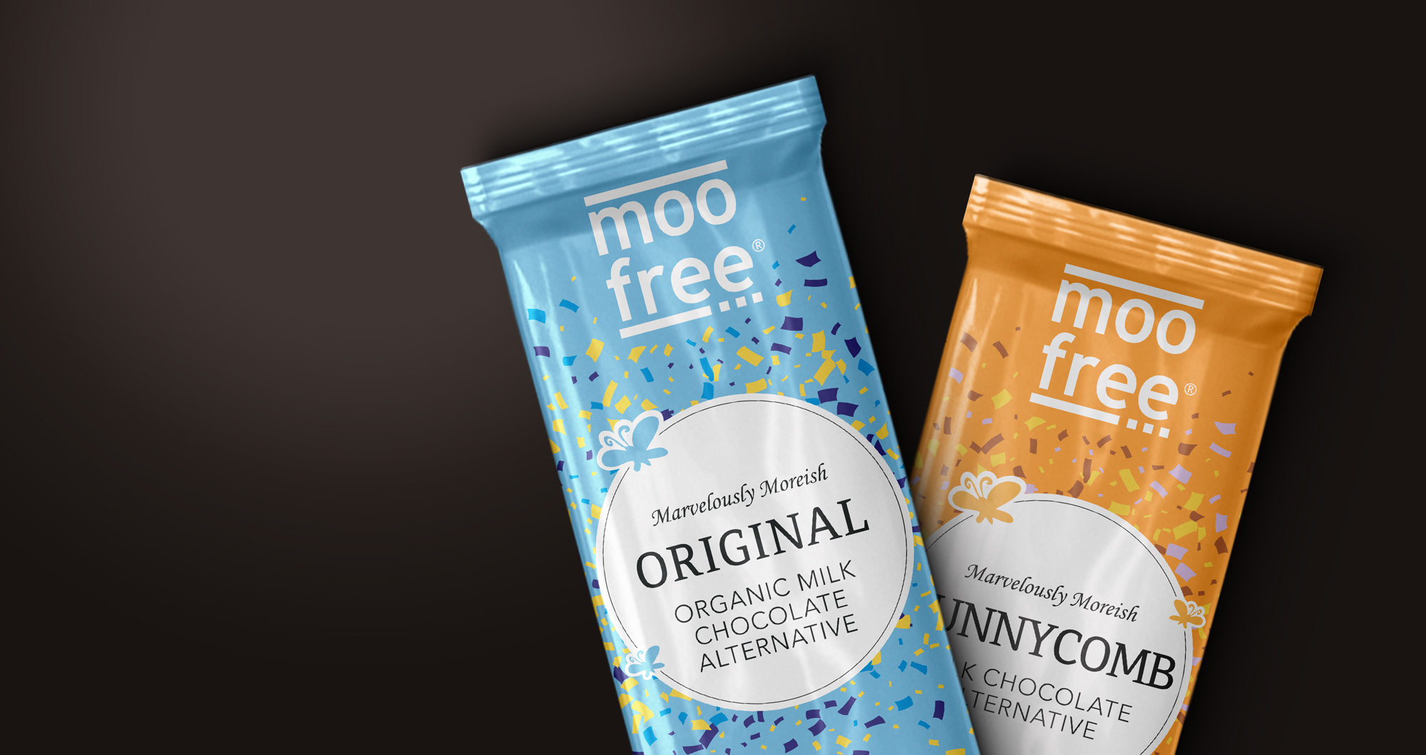
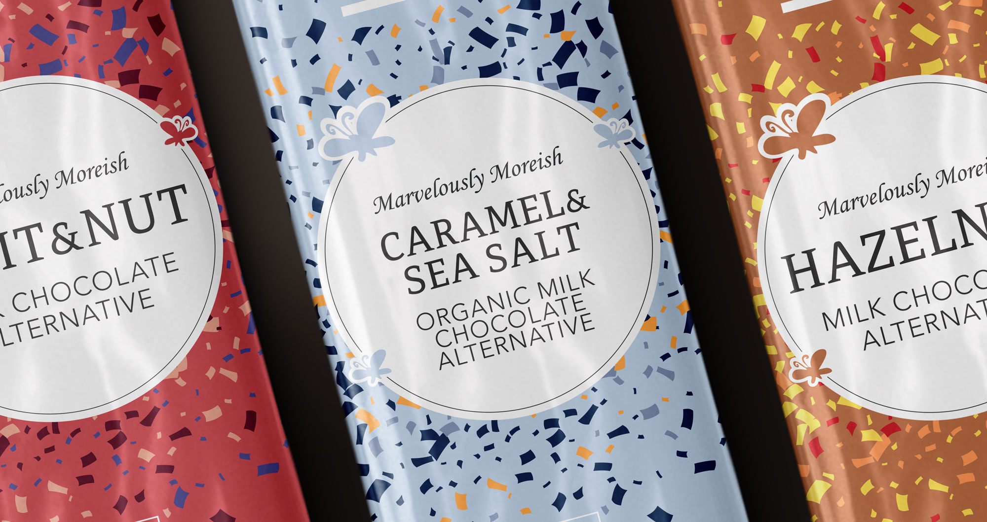
For the Luxury range concept designs we worked on using a subtle hint to the client’s illustration style using the butterflies. We focussed on a type system that felt both high-end and friendly. The concept of colourful confetti with different coloured backgrounds linked back to the companies fun-loving nature. A ribbon tag was also introduced for the ‘free from’ values.

Moo Free Packaging Design
Moo Free Packaging Design Dark Chocolate Easter Egg
Moo Free Packaging Praline Selection Box

Results

The Results.

Moo Free’s products now look as good as they taste. Previously they had been designing in house and so working with an external agency has both lifted that resource requirement and allowed for better unification for their brand.

Moo Free Selection of three easter egg packaging design
Moo Free Chocolate Egg Packaging Design
Moo Free Choccy Chums Packaging Design