Daily Poppins
We pop in so you can pop out.
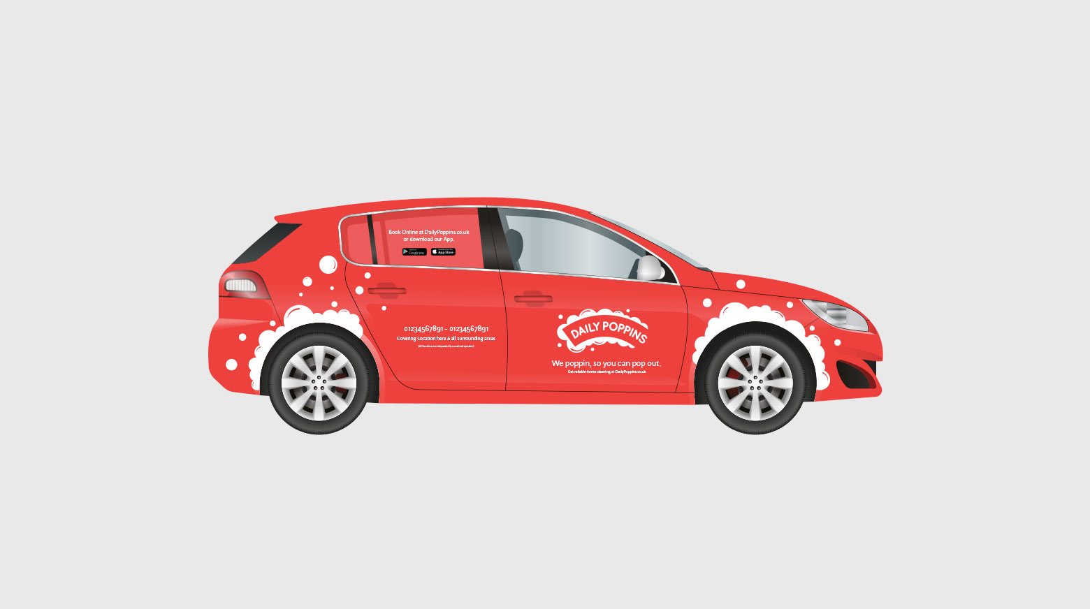
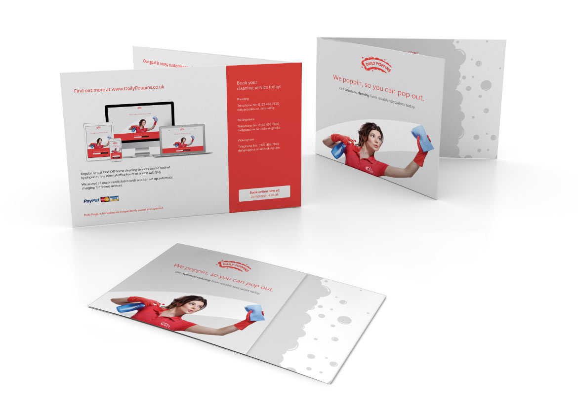
Brand clean up for a national cleaning franchise. Rebrand, Responsive Website, Stationery, Car livery, Printed and online marketing. Website by ClearBrand:
www.dailypoppins.com
Banner
Brief
The Brief.
Daily Poppins are a national domestic and professional cleaning franchise, with over 50 sites across the UK. They came to ClearBrand wanting to modernise their brand and website, while improving user experience and brand recognition.


Solution
The Solution.
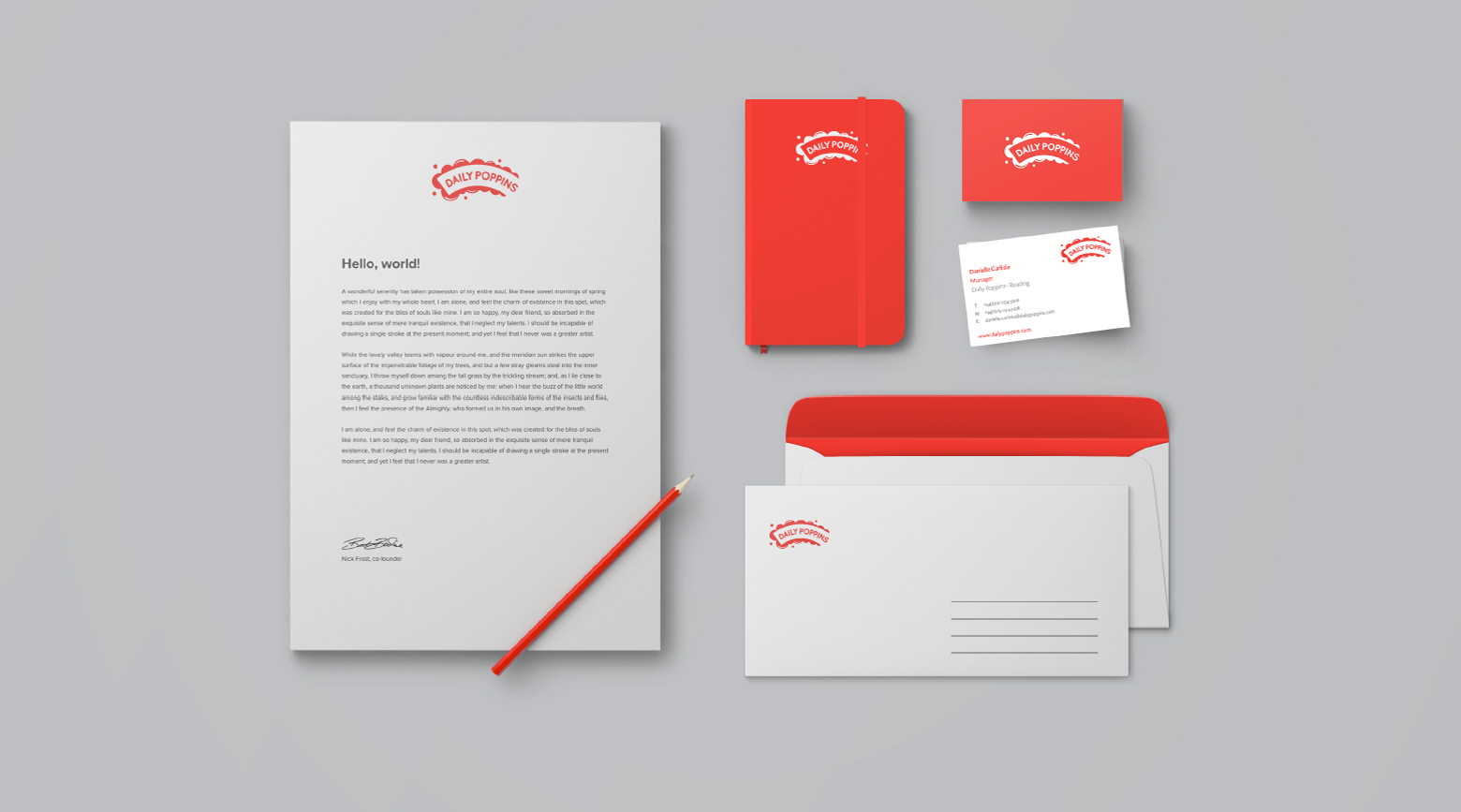
We kept the brand red, which Daily Poppins had been known for, but picked a subtler less-harsh version for the colour. The previous logo had an illustration of the fictional character Mary Poppins. We made away with the character allowing the name to speak for itself and creating an integrated iconic mark symbolising the cleaning effect. The rounded bubble effect and chosen typeface gave a lighter and friendly appeal to the brand.
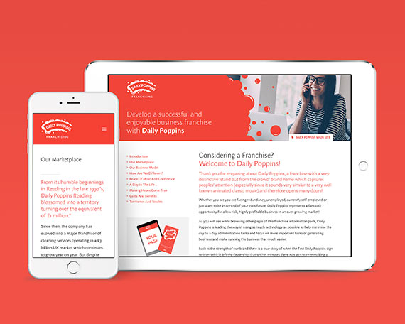
We created an improved website design that users love and a mobile ready, modern web experience.

-
PANTONE®
238 C


Daily Popins Red
CMYK100 / 3 / 56 / 18
RGB0 / 132 / 118
#008376
-
PANTONE®
7706 C


Daily Popins Dark Red
CMYK95 / 0 / 32 / 32
RGB0 / 124 / 167
#007ca6
-
PANTONE®
2271 C


Daily Popins Dark Grey
CMYK68/ 0/ 85 / 0
RGB87 / 178 / 81
#56b050
-
PANTONE®
2985 C


Daily Popins Grey
CMYK65 / 0 / 3 / 0
RGB66 / 192 / 236
#42bfeb

Client testimonials
“We are really happy with the branding and website outcome. We look forward to continuing our work towards making Daily Poppins a household brand in partnership with ClearBrand.”
– Nigel, Daily Poppins Director

Results
The result.
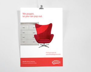
With the new identity and updated website, Daily Poppins have a brand for the digital age. A new logo better optimised for web, a mobile ready website, modern web experience and an improved design users love are helping them to visually dominate the market.
Website by ClearBrand: www.dailypoppins.com

