Omega Diagnostics
Informing decisions, Improving health
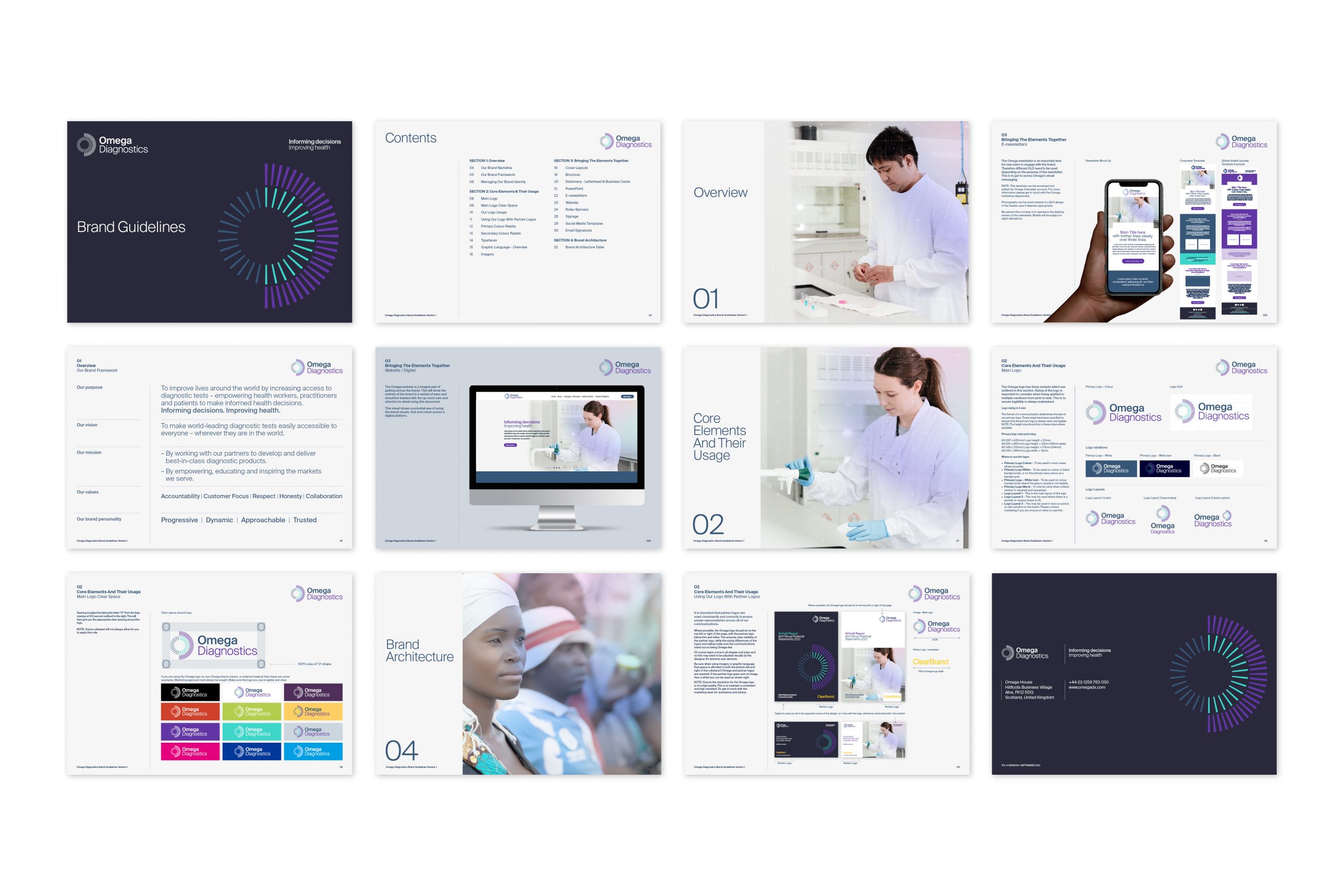
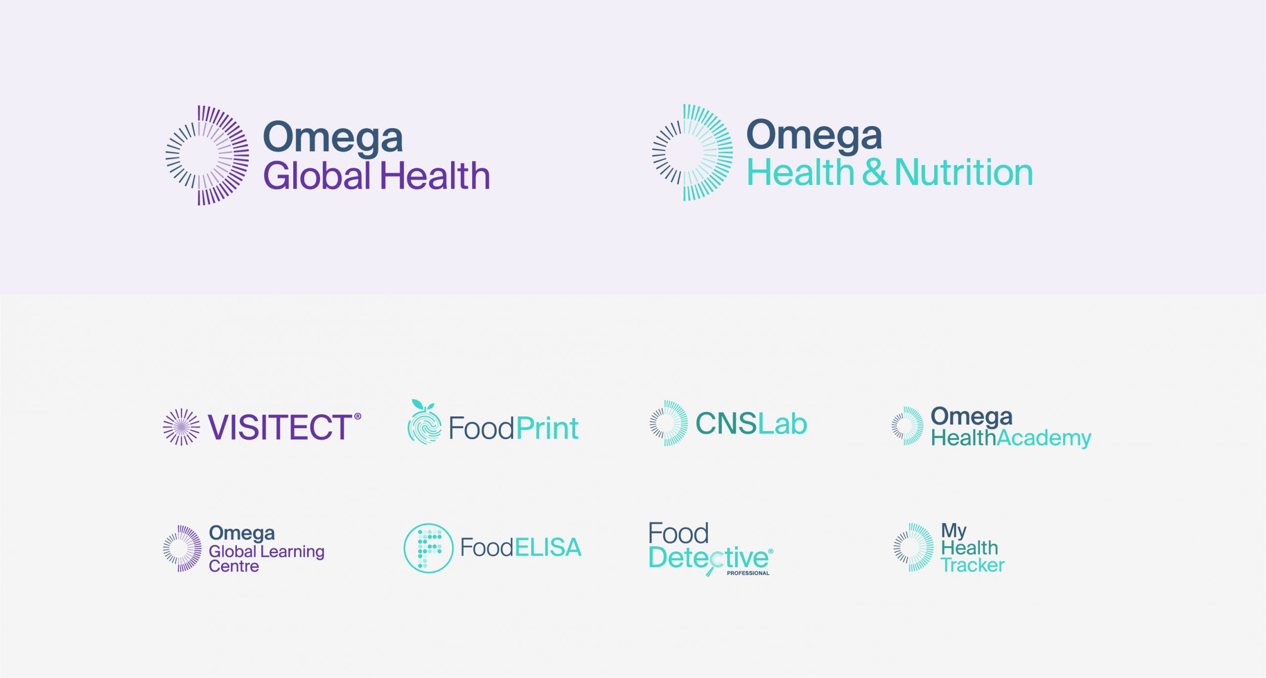
Full rebrand, brand narrative and brand guidelines for a company working with the government to produce COVID-19 rapid test kits. ClearBrand created a visual system and brand hierarchy for the main Omega brand and multiple sub brands to bring clarity to their audience.
Banner

Brief
The Brief.
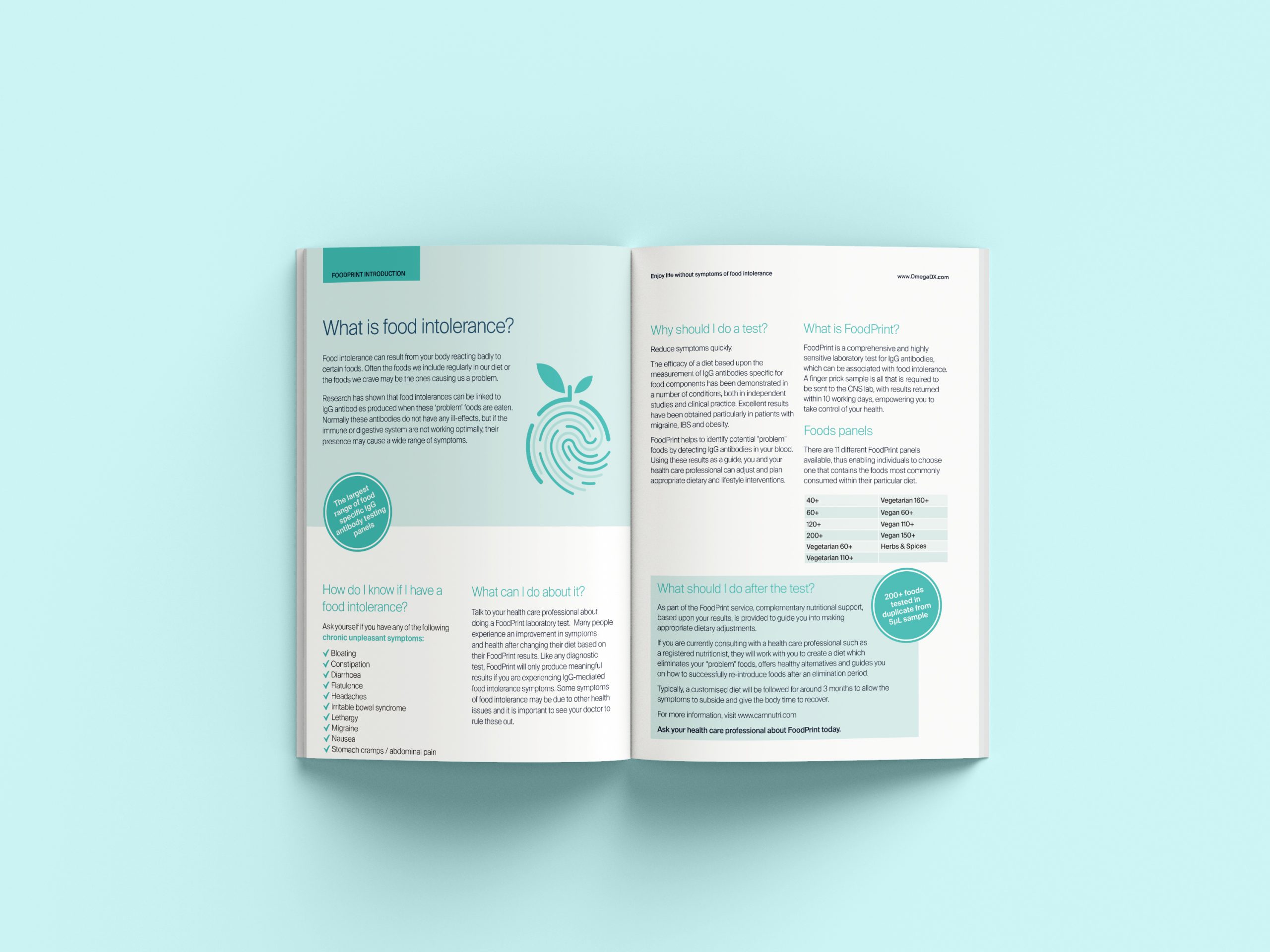
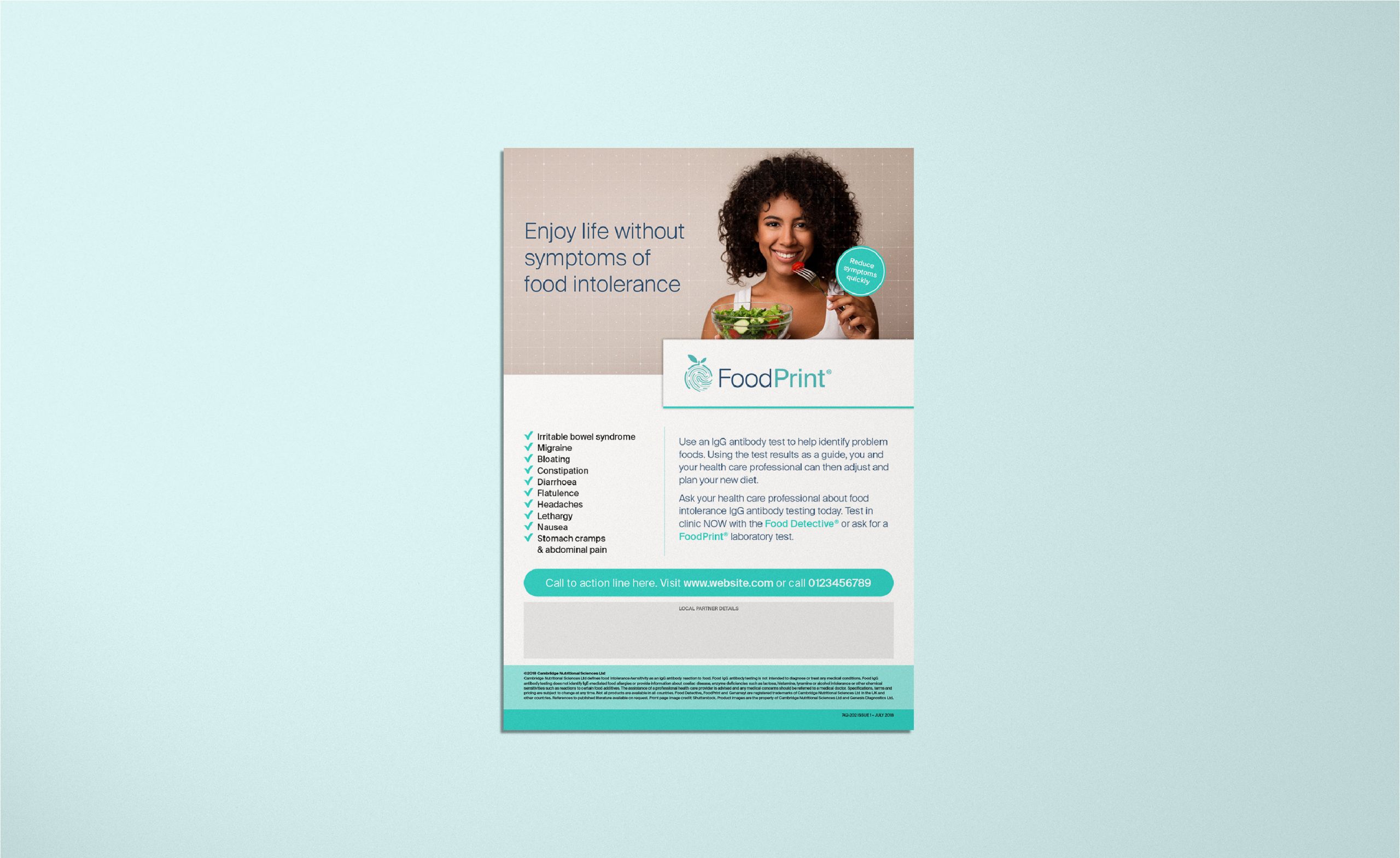
Omega Diagnostics approached ClearBrand with the brief to create a more modern corporate ID which reflected its brand personality, as well as greater harmonisation between the product brands offered and a more focused approach to messaging. Omega Diagnostics is currently comprised of two divisions – Global Health (covering CD4 testing for HIV and COVID-19), and Health and Nutrition (focusing on food intolerance testing). These divisions have separate markets, customers and business models but share common values and strengths. Our goal was to reflect these shared qualities as the basis of a unified brand identity. Critically, we also recognise the importance of communicating the particular strengths each business brings to its own market. By doing that we’ll allow both businesses to draw strength from the Group, whilst maximising their own potential. Given the global nature of the business, the language and visuals we use needed to be as direct and clear as possible.

Narrative
The Solution.
We ran a round of discovery meetings followed by brand workshops with key stakeholders to eventually establish a clear brand narrative for Omega. One thing that came across was that although they are very different sides of the business, there are more similarities than we may think from a branding perspective. Both parts of the business focus on providing information on health, which allow for healthcare professionals to either improve health or save lives.
We agreed on a leading line of ‘Informing decisions, Improving health’ as a simple strapline taken from their purpose: “To improve lives around the world by increasing access to diagnostic tests – empowering practitioners and patients to make informed health decisions.” We developed a brand personality framework that outlined them as Progressive, Dynamic, Approachable and Trusted. This allowed us to set a strong verbal position to begin the design element of the project.
Results
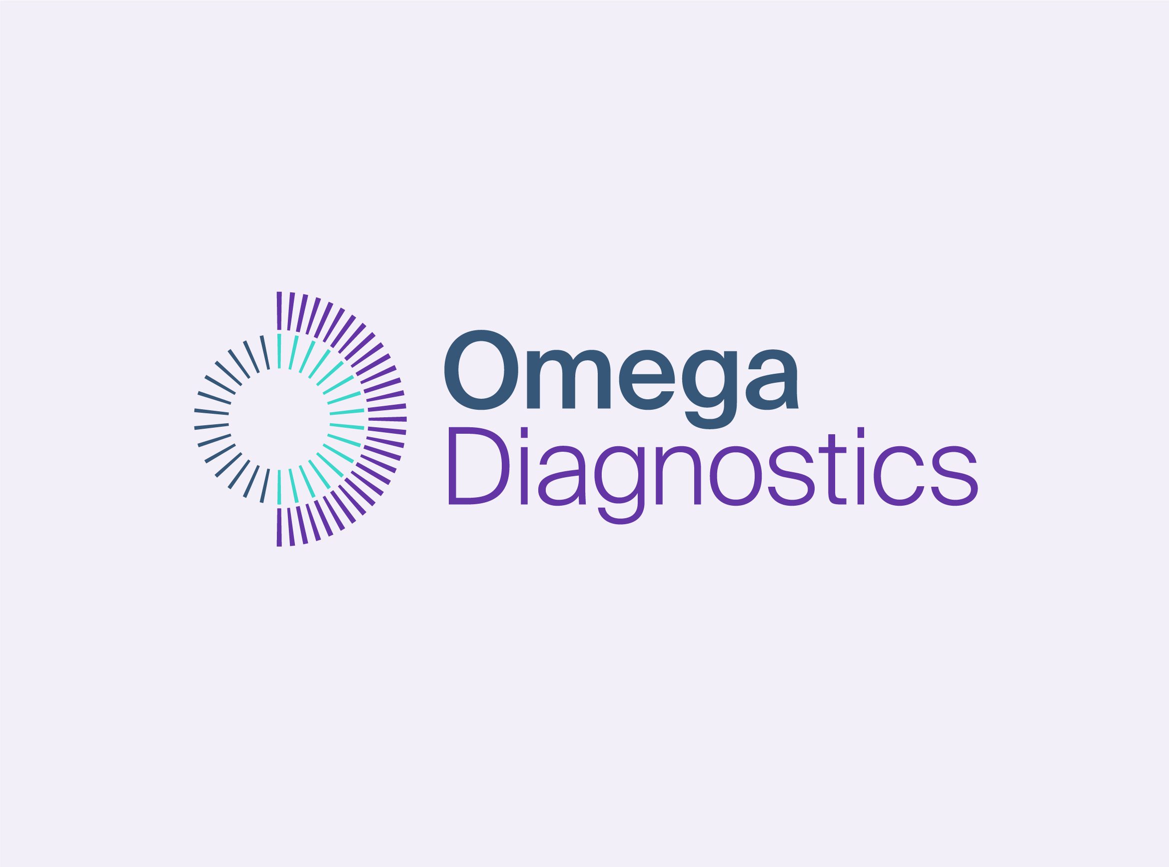
The Results.
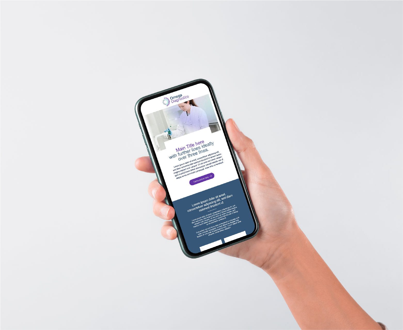
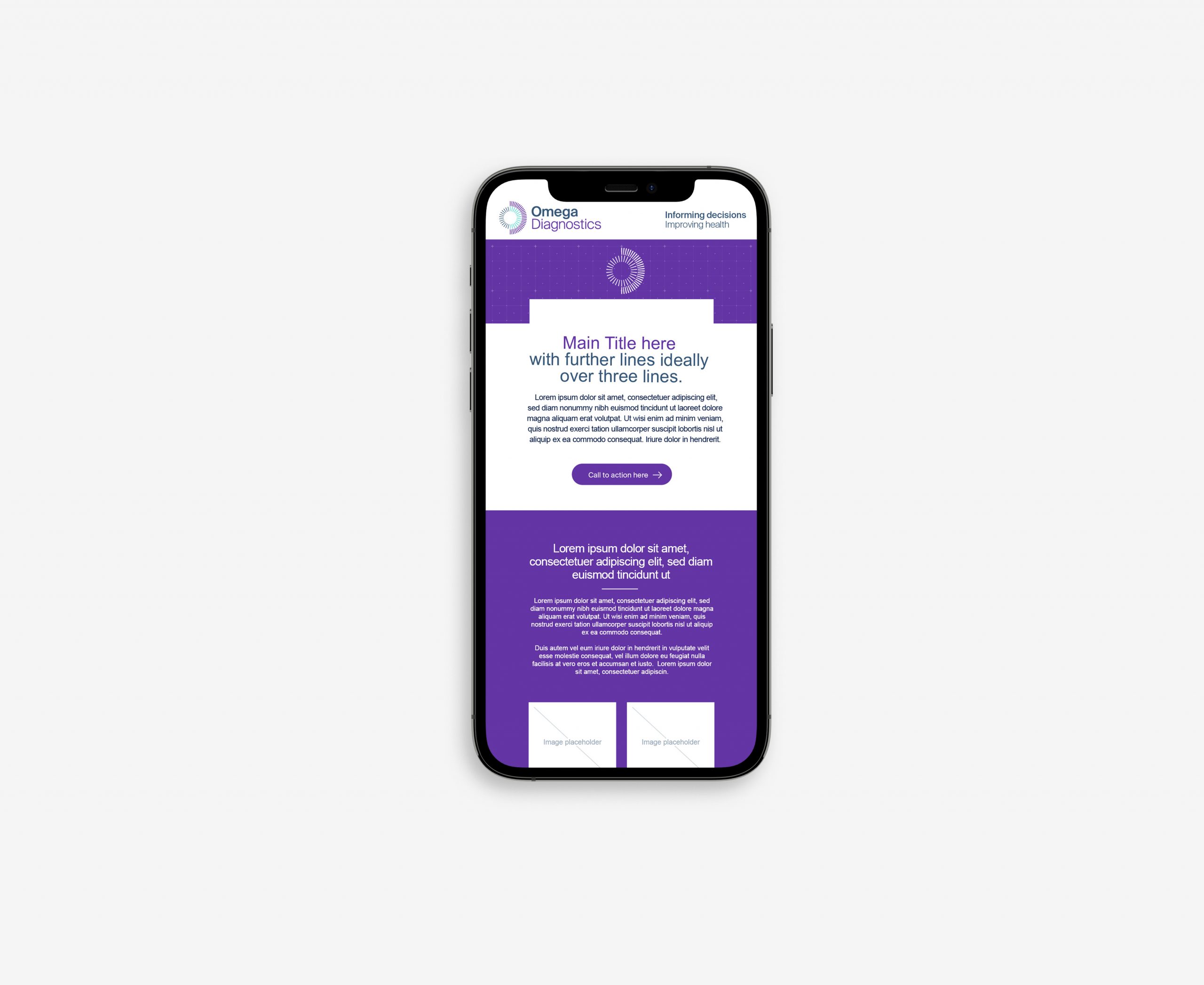
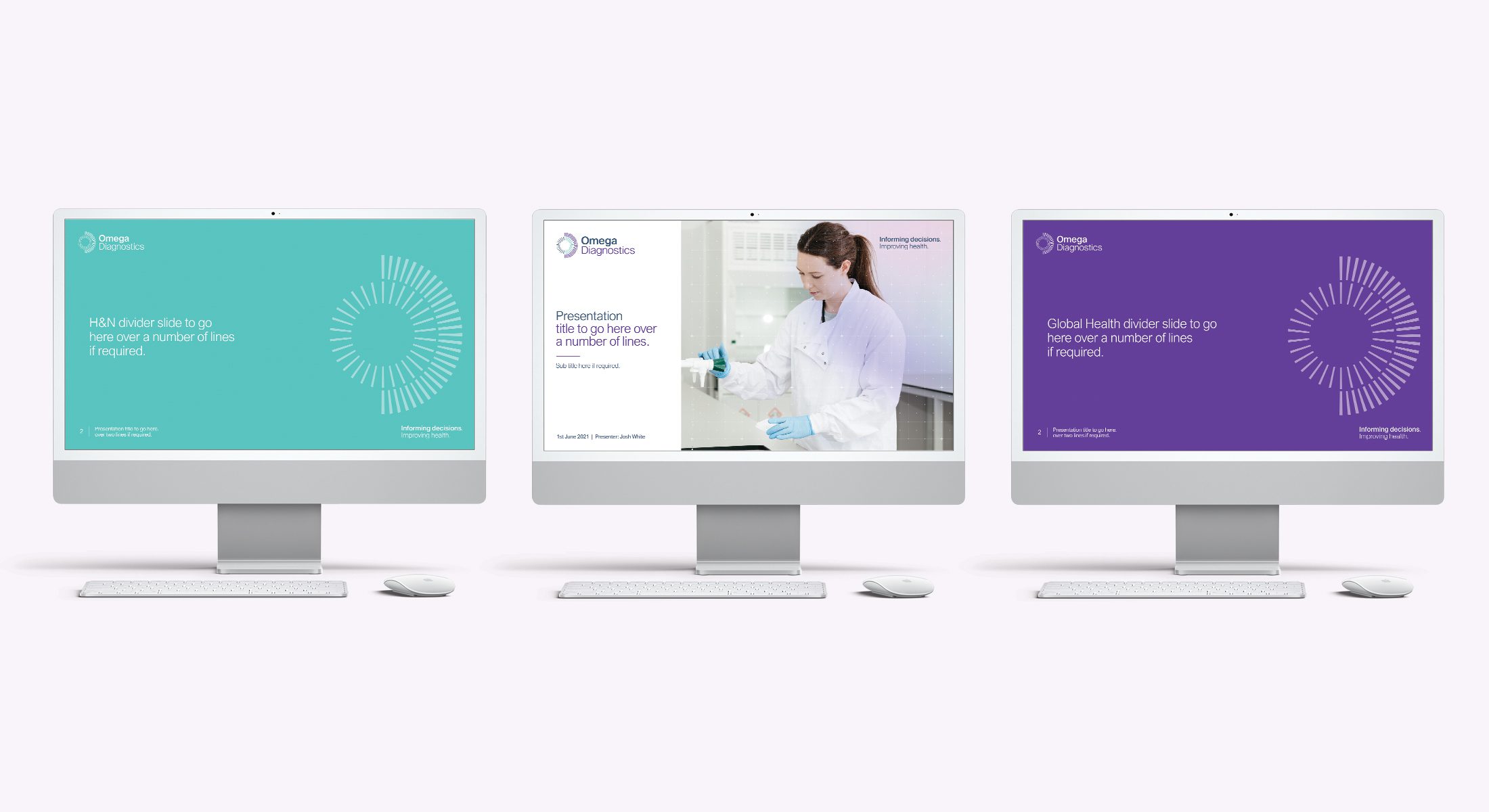
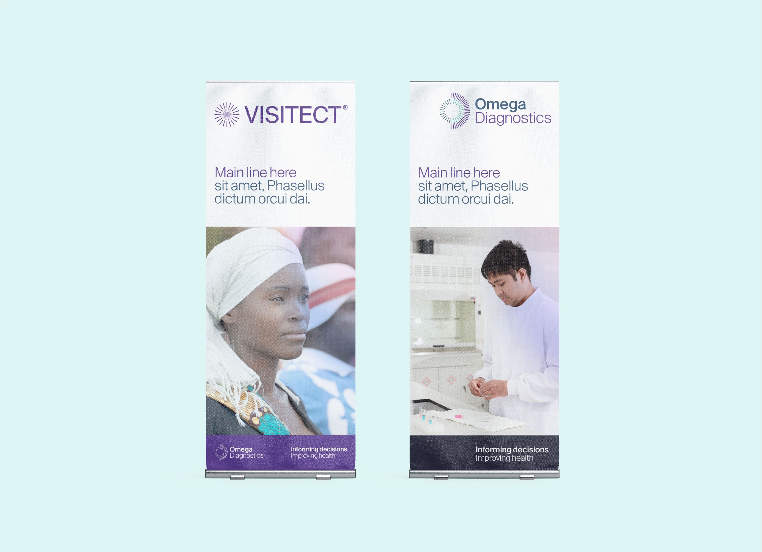
Having a clear brand narrative made the design work far simpler.
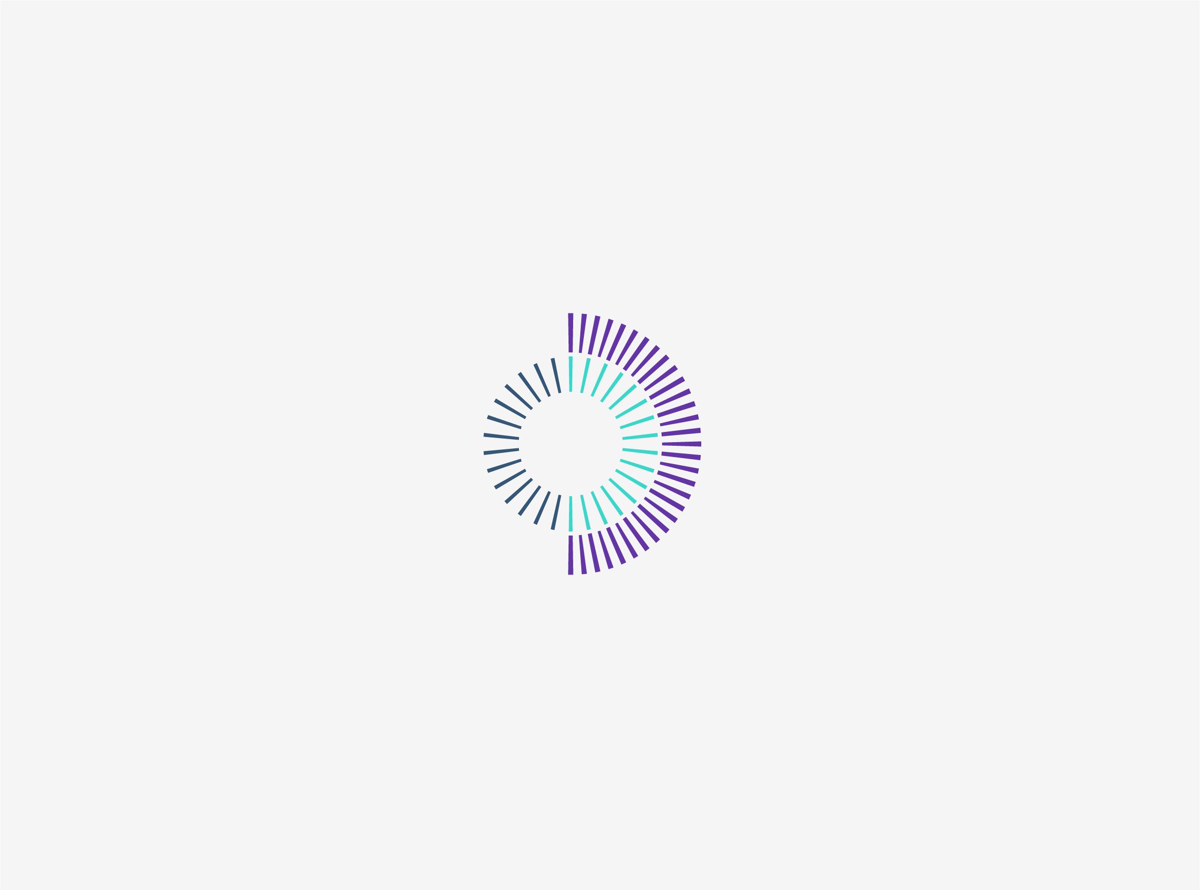
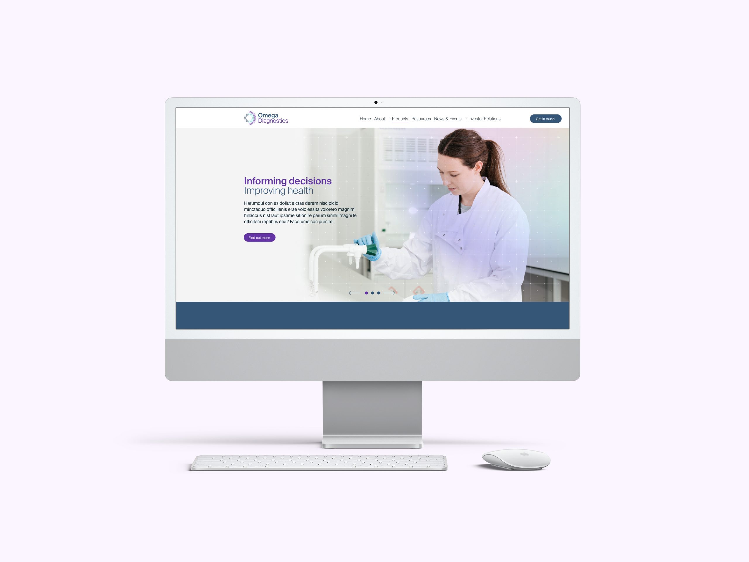
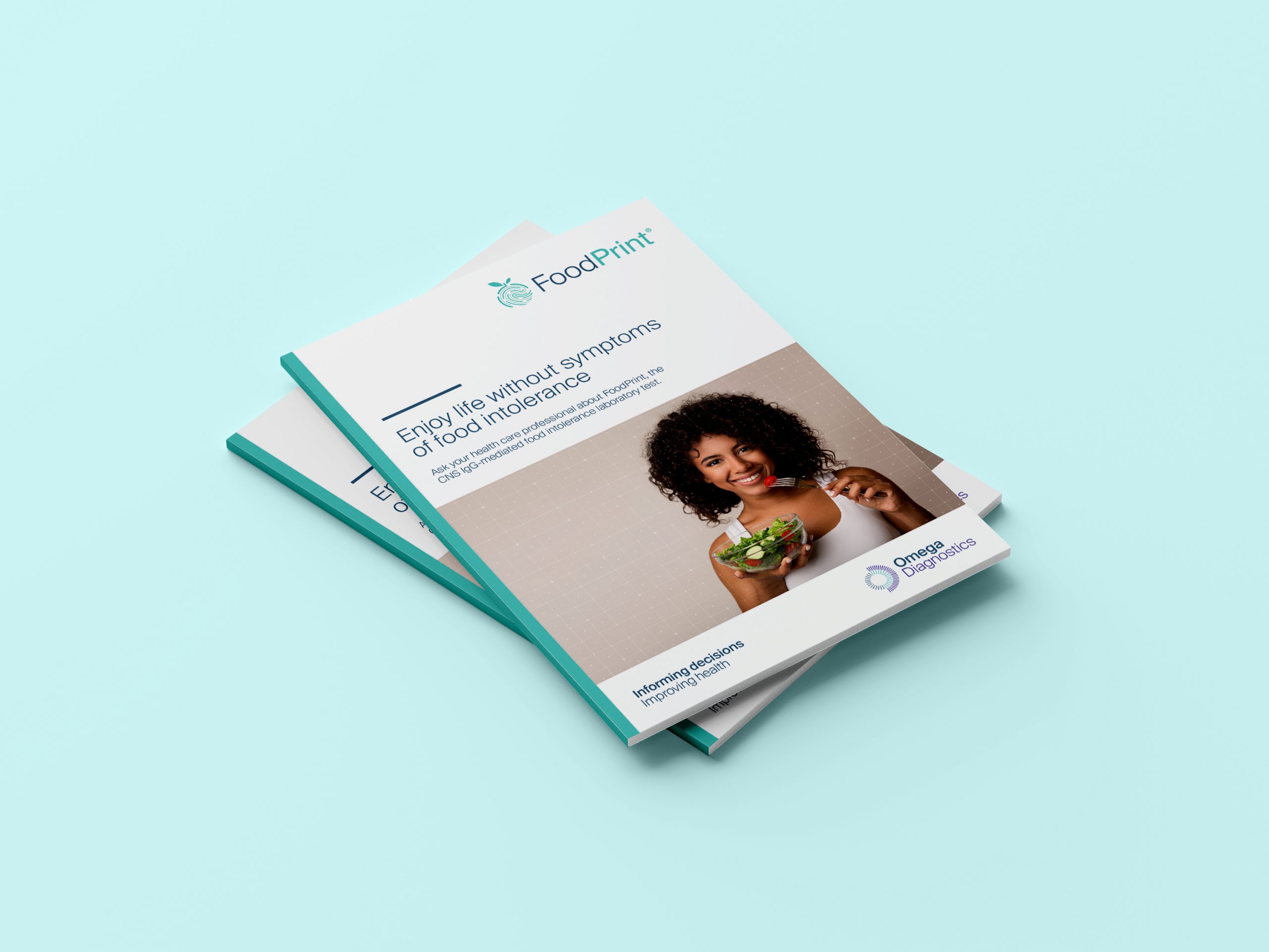
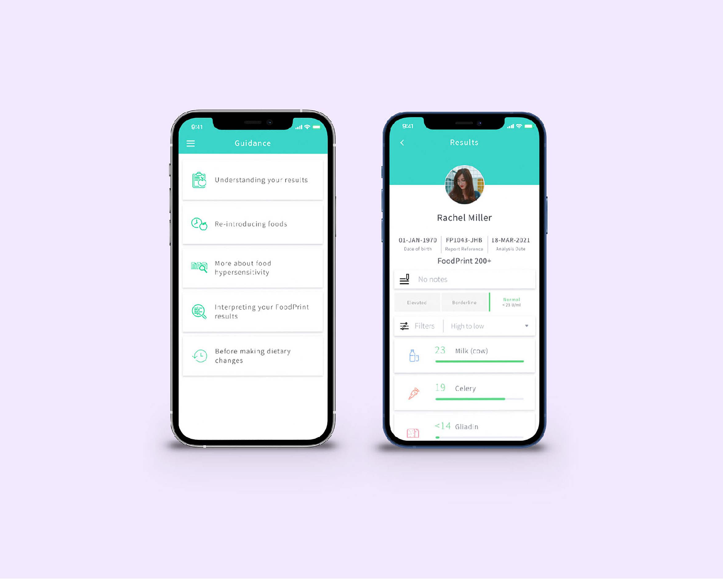
The logo was created as an assimilation of “O” and “D” in the main icon. We also used a ‘radar’ visual approach to the icon, representing searching for the answer, detection and identification. We built a visual system utilising light photography shots of their laboratories and staff with a grid layered over the top to again suggest the idea of testing and diagnosing and defining a patient’s health. In their food intolerance testing for example, they map out the user’s different ranges of intolerance across a wide range of foods. We provided a range of new colour options and the client was happy to move away from their old dated set to a brighter green and purple set.