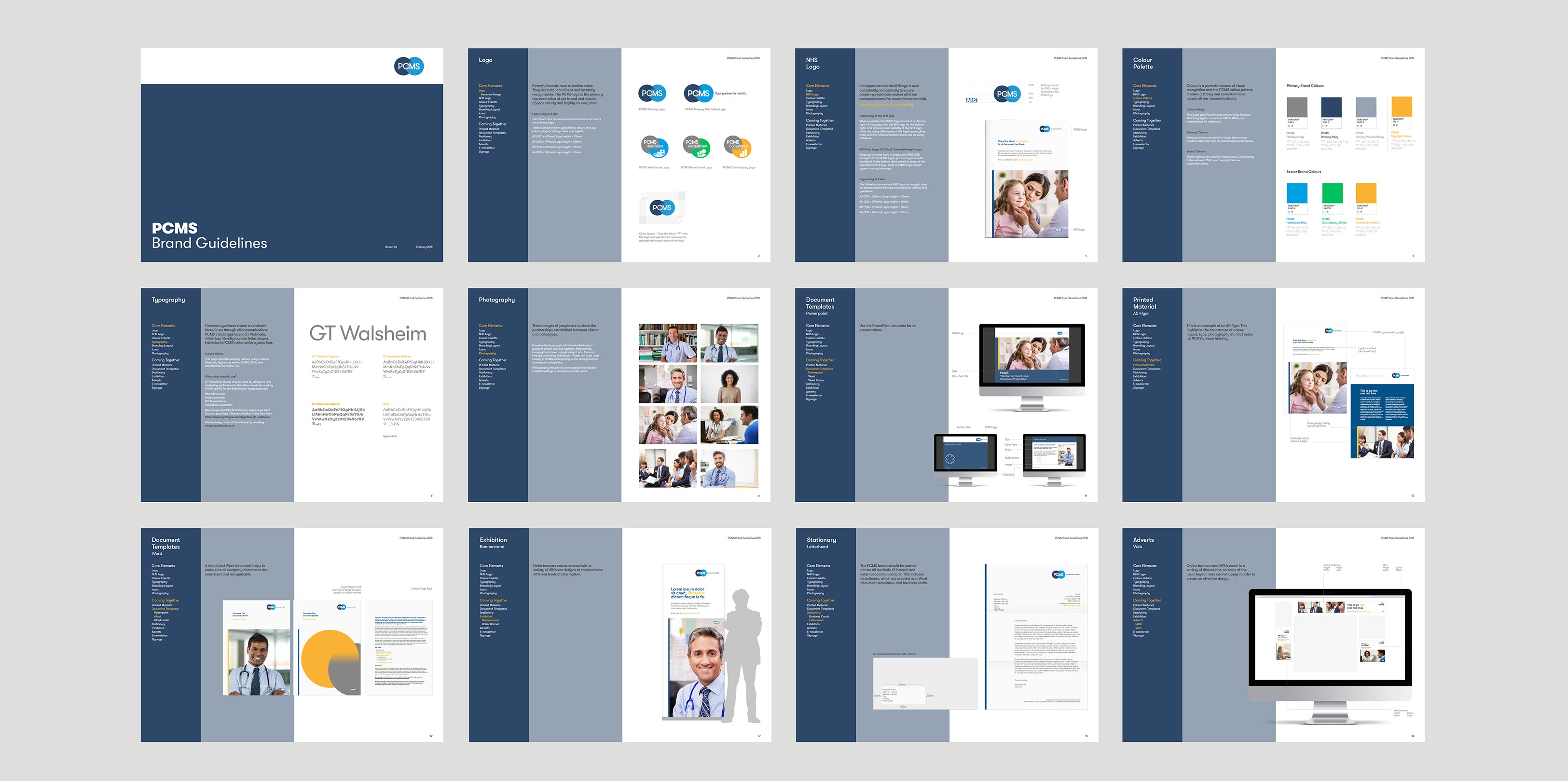
PCMS
Your partner in health.
A rebrand (with sub brands) and a cohesive set of guidelines for a growing London based healthcare provider.
Banner

Brief
The Brief.
Primary Care Management Solutions (PCMS) came to ClearBrand as a specialist healthcare management consultancy. Their challenge was that, as well as offering management consultancy, their services were now extending to the daily running of healthcare practices and recruitment for positions within the practices. The rebrand needed to communicate this simply and clearly.


Solution
The Solution.
ClearBrand helped developed a clear hierarchy for the brand. The tagline ‘Your partner in health’ was introduced which positioned PCMS as a partner to practices, with a series of offerings, positioned as sub brands with associated logos.
The logo was designed to show partnership of two shapes blending together. The sub-brands follow this theme with a separate icon and colour ways for each sub-brand.
See the website here: pcmsolutions.co.uk


-
PANTONE®
7694 C
PCMS Navy
CMYK100 / 41 / 0 / 39
RGB44 / 71 / 104
#2c4768
-
PANTONE®
129 U
PCMS Yellow
CMYK0 / 25 / 86 / 0
RGB250 / 178 / 51
#fab233
-
PANTONE®
2995 U
PCMS Blue
CMYK89 / 0 / 1 / 0
RGB0 / 158 / 226
#009ee2
-
PANTONE®
2422 U
PCMS Green
CMYK68 / 0 / 89 / 0
RGB0 / 193 / 96
#00c160
-
PANTONE®
445 U
PCMS Grey
CMYK0 / 0 / 0 / 62
RGB135 / 135 / 135
#878787

Results
The Results.
The guidelines work has enabled PCMS to simplify their previous visual appearance. There is now an established look to their branding and marketing that allows PCMS to approach larger practices with a more professional visual approach.
“The site looks great and thanks to you and your team for the extra effort you have gone to get our branding right for us.”
– Sheraz Khan, PCMS Owner


