Marketing for defence sector specialists in cloud solutions and public sector customers. ClearBrand worked across video work, illustration, iconography, brochure and marketing templates.
Banner
Brief
The Brief.
SecureCloud+ came to ClearBrand wanting to elevate their current marketing material which was dated and not delivering the impact they desired to match their company aspirations. We undertook a discovery stage to understand their technology company background and their defence customer network to better recognise the type of visual impact they desired.
Narrative
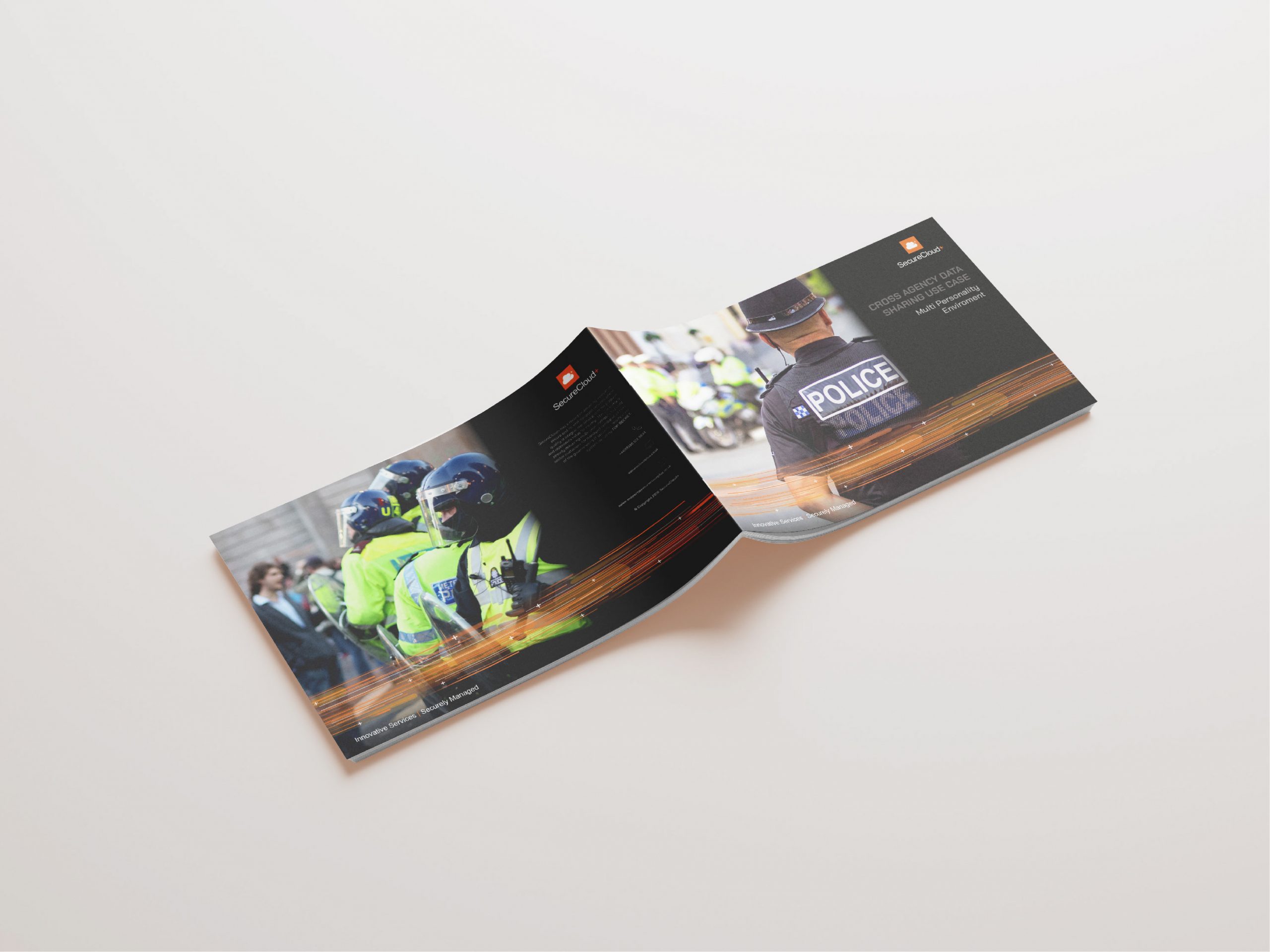
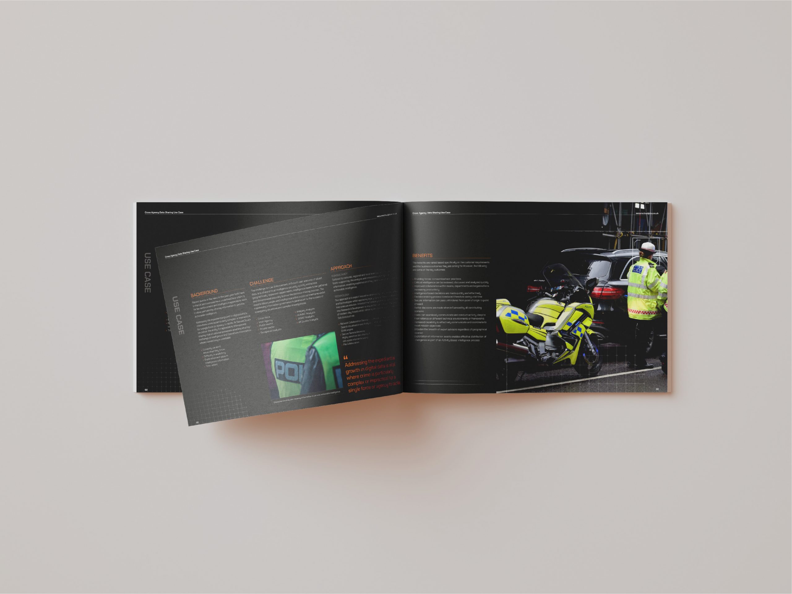
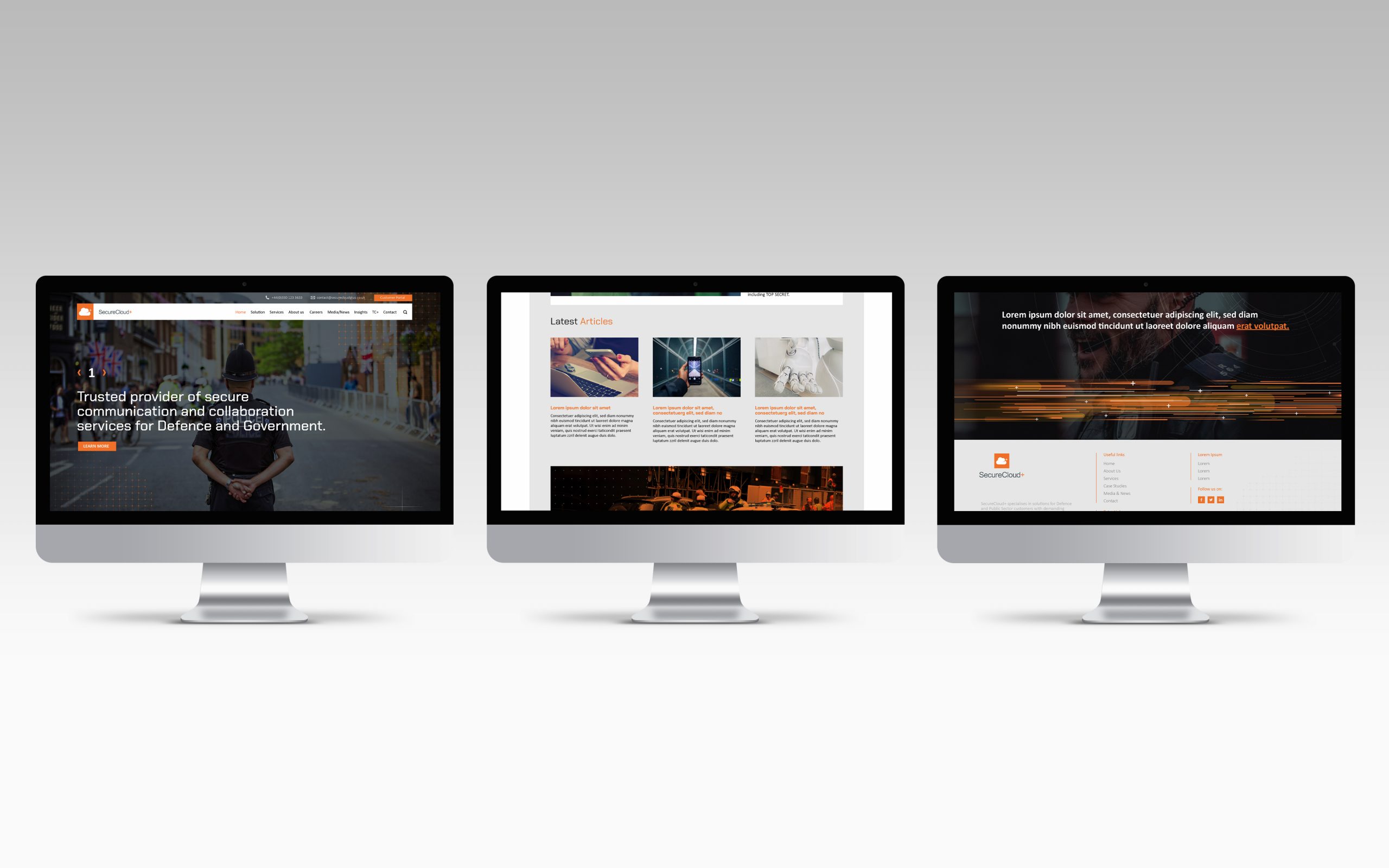
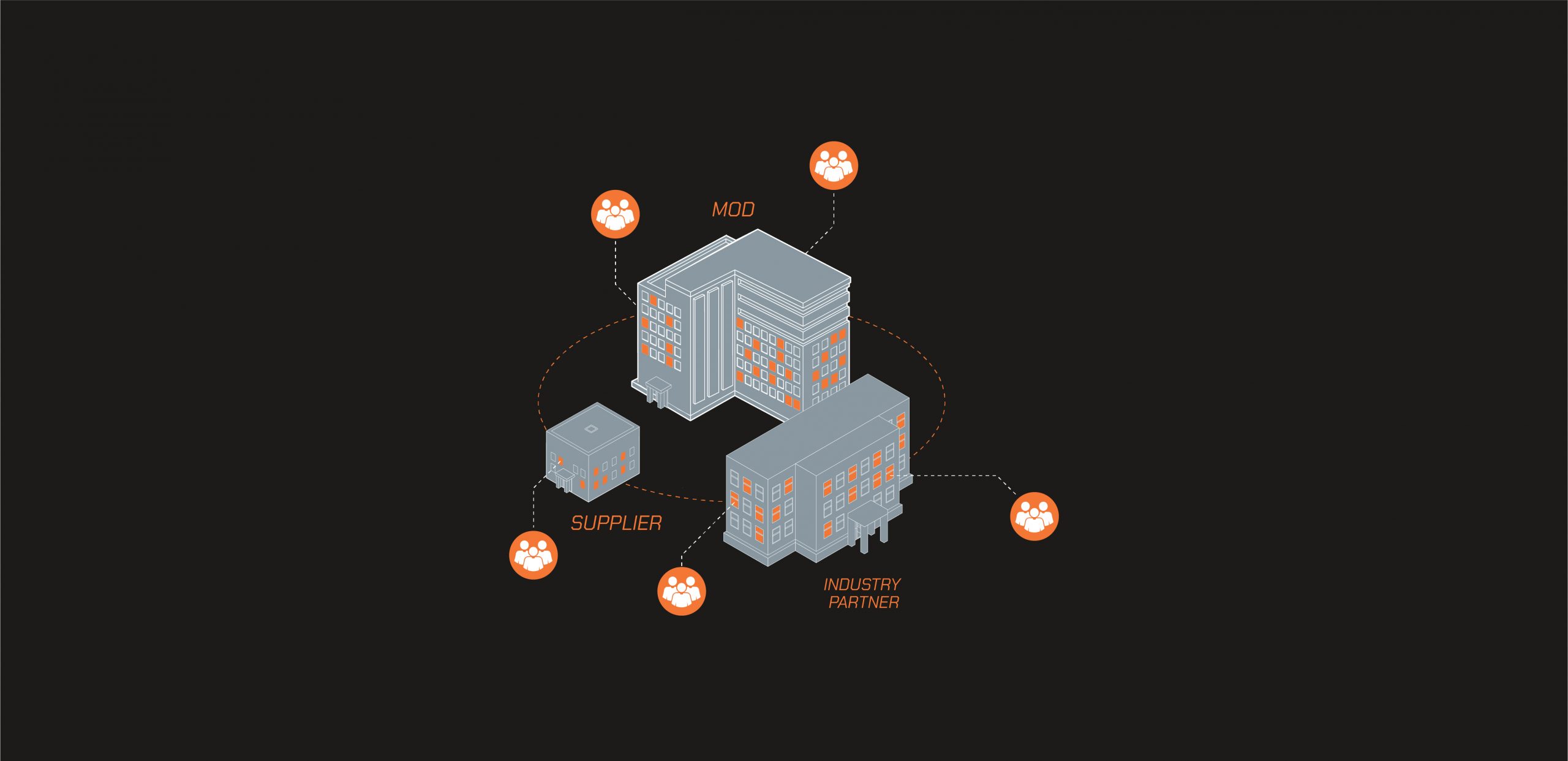
The Solution.
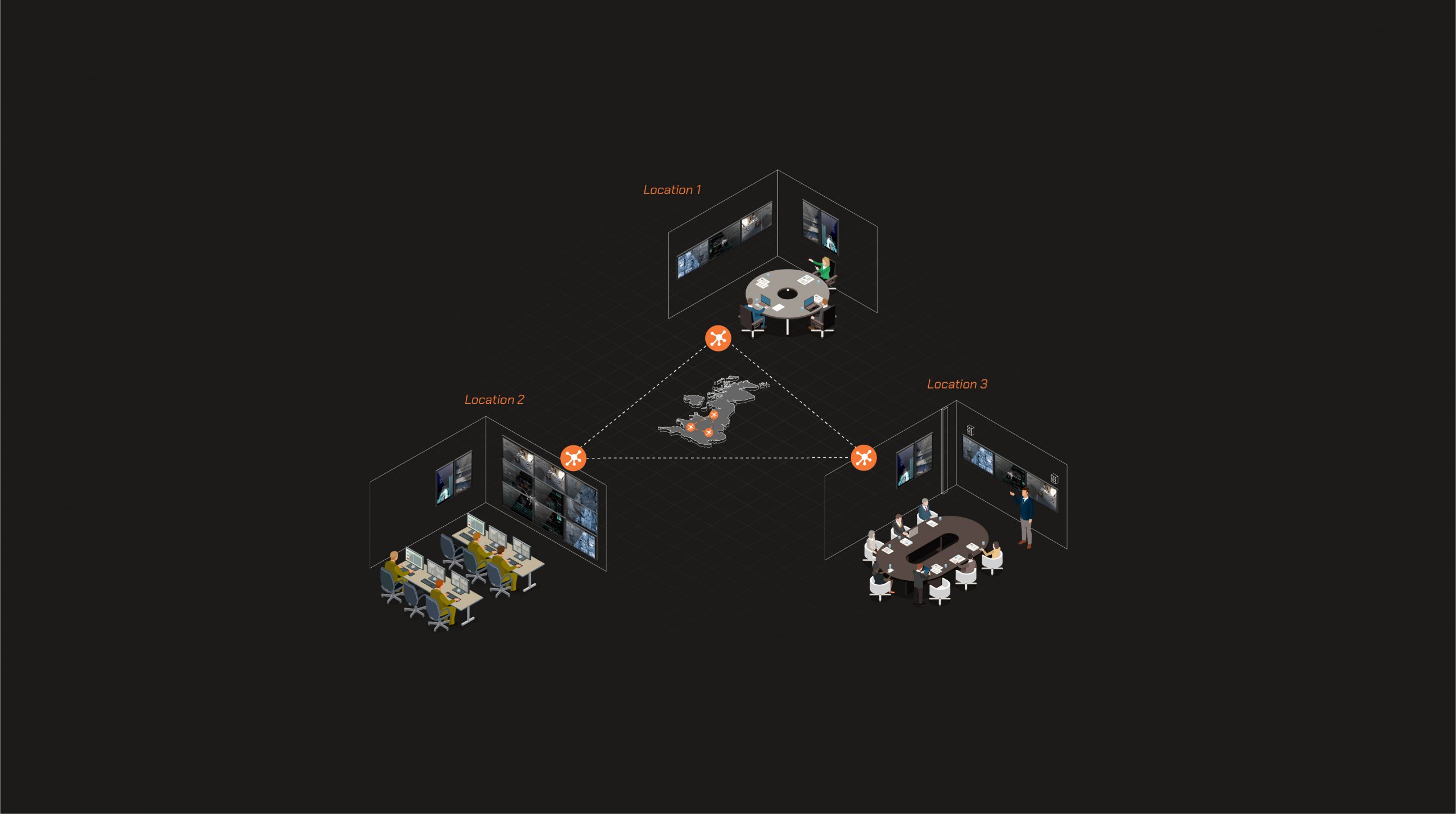
As they produced a large amount of video collateral we focused on this initially. We animated the company logo intro to represent data lines and the large amount of data they deal with. This created a dramatic initial first impression. Videos were then created using the + symbol as a consistent graphical device that moved through the video slide transitions.
Previous marketing material was light in approach, so we transformed the materials with a dark visual palette to allow the brand orange to stand out. Brochure templates used the data lines from the logo animation to keep consistency running through top level documents. We introduced a new modern angular font which suited the serious nature of the defence environment they worked in.
Results
The Results.
“Great innovative design and customer service. ClearBrand is a great company with a lot of creative ideas and never fails to impress. The team are lovely and very responsive to quick deadlines. The work is very high quality.” SecureCloud+ marketing team.
Would your business benefit from a ClearBrand? We'd love to talk to you today.