Soho Grey
Reliable and quality-driven home renovation specialists.
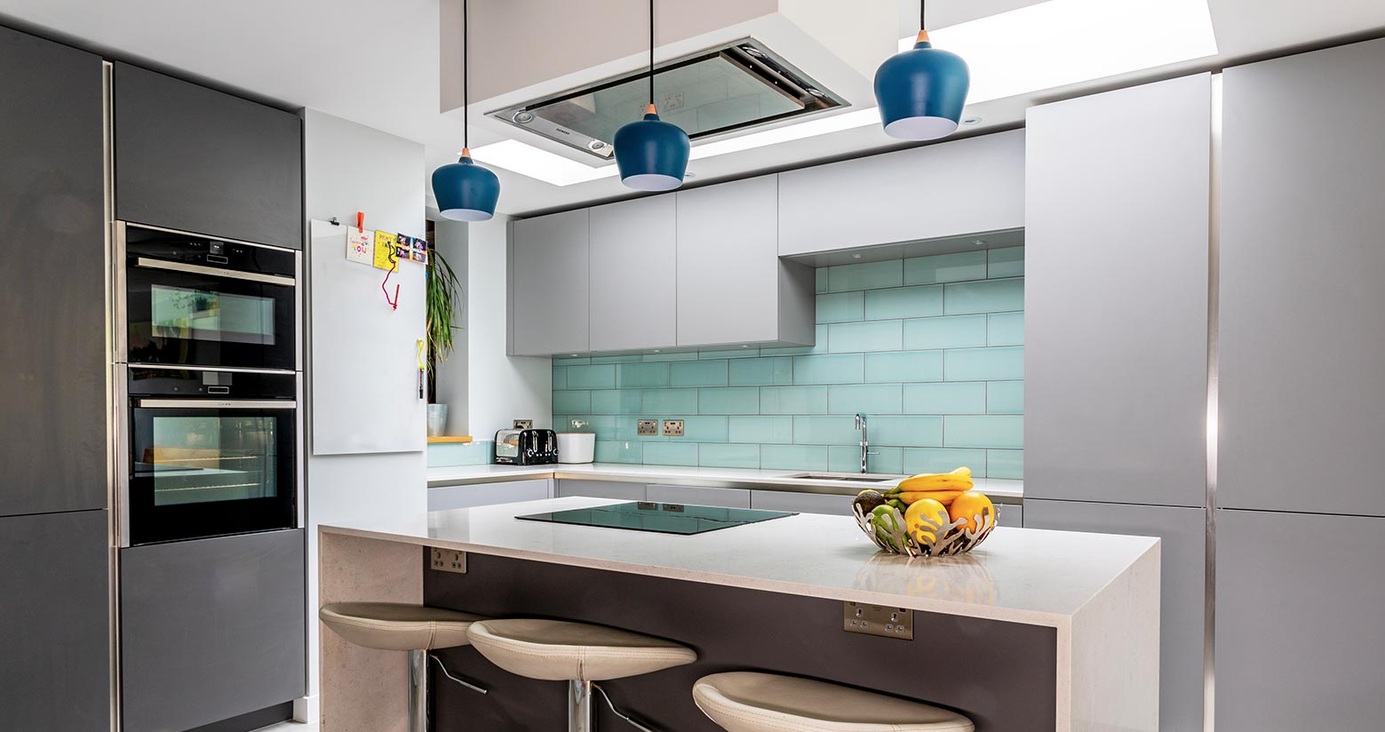
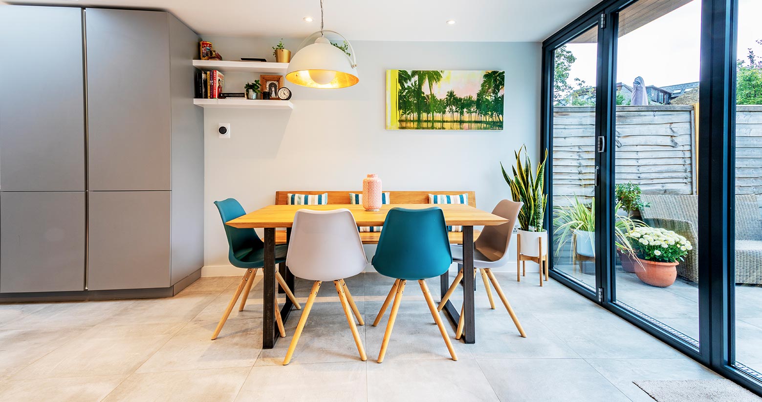
London based property developer Soho Grey focus on extensions, refurbishments and renovations across West, South and Central London. ClearBrand updated Soho Grey's branding alongside designing a new portfolio website, photography, guidelines, vehicle design and more to help create a consistent and unique brand.
Banner
Brief
The Brief.
Soho Grey has over 100 years of combined expertise in the property industry. ClearBrand were approached to update Soho Grey’s current brand to help enforce its own identity in the market whilst having a visual language which is unique to them.

Solution
The Solution.
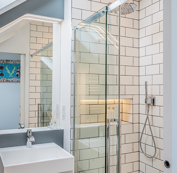
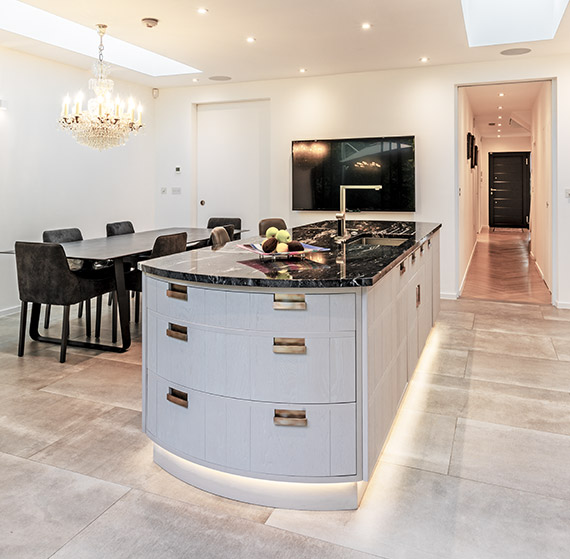
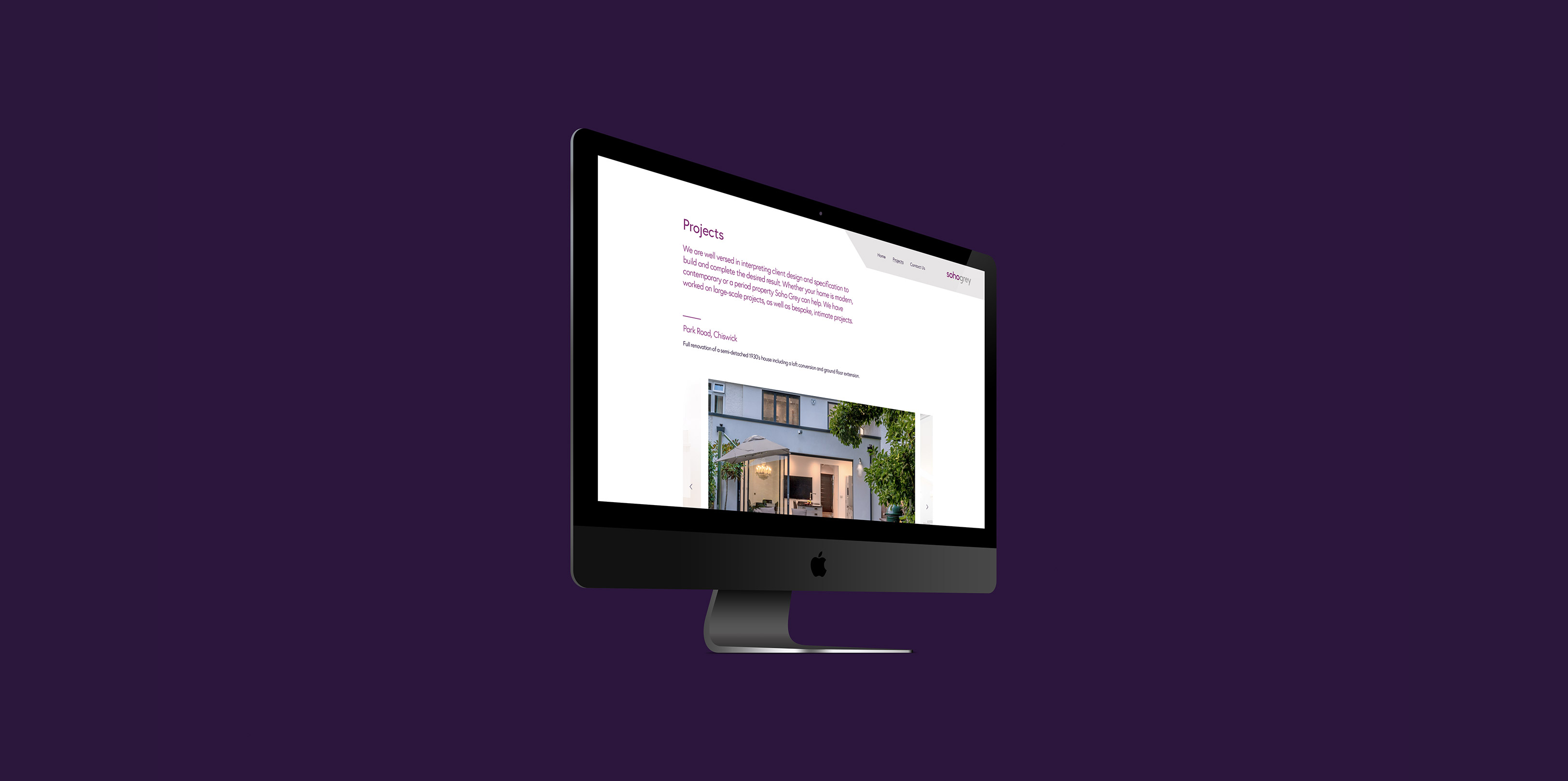
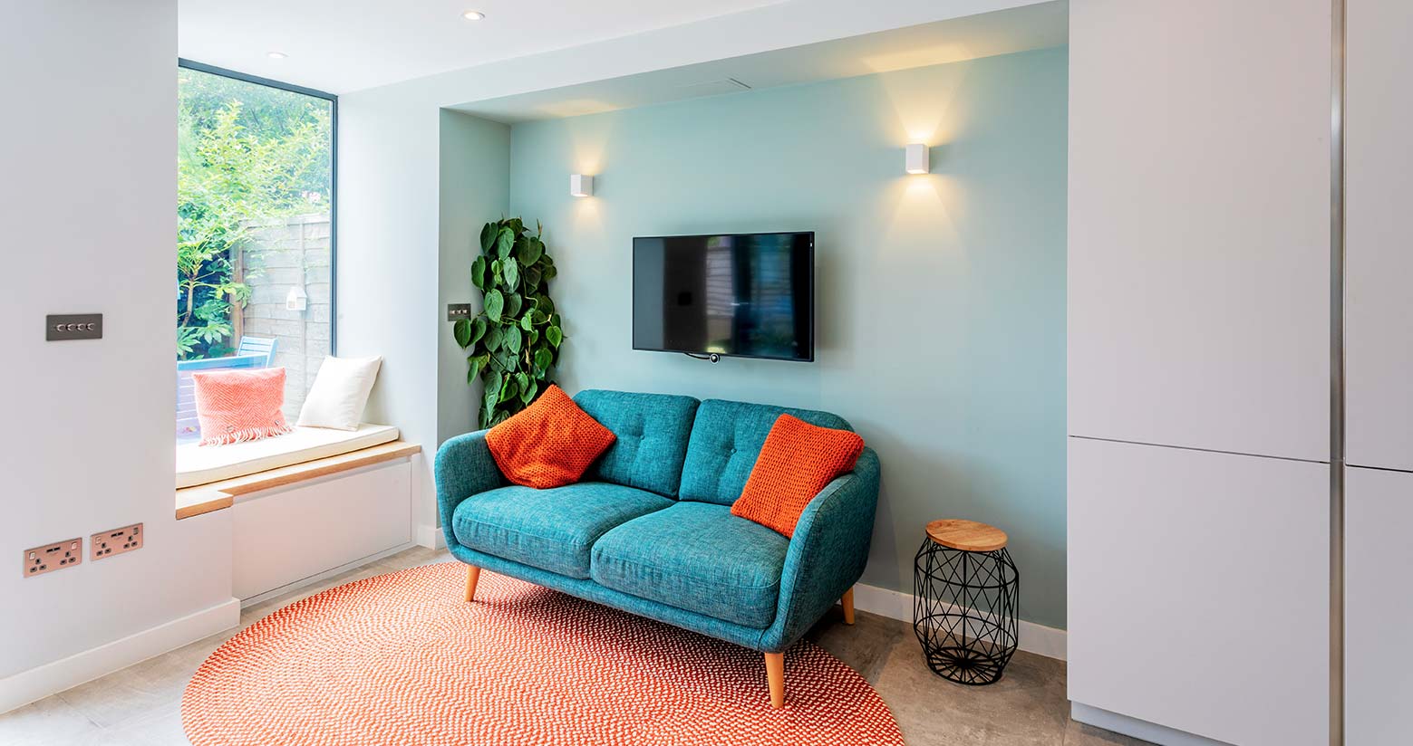
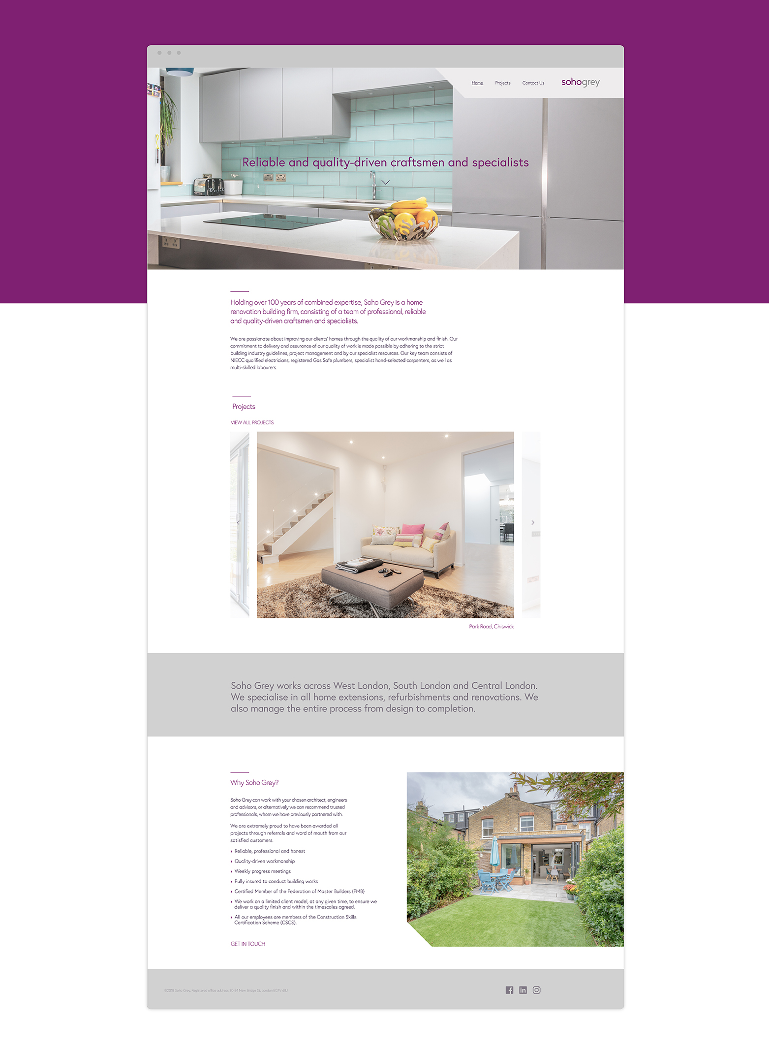
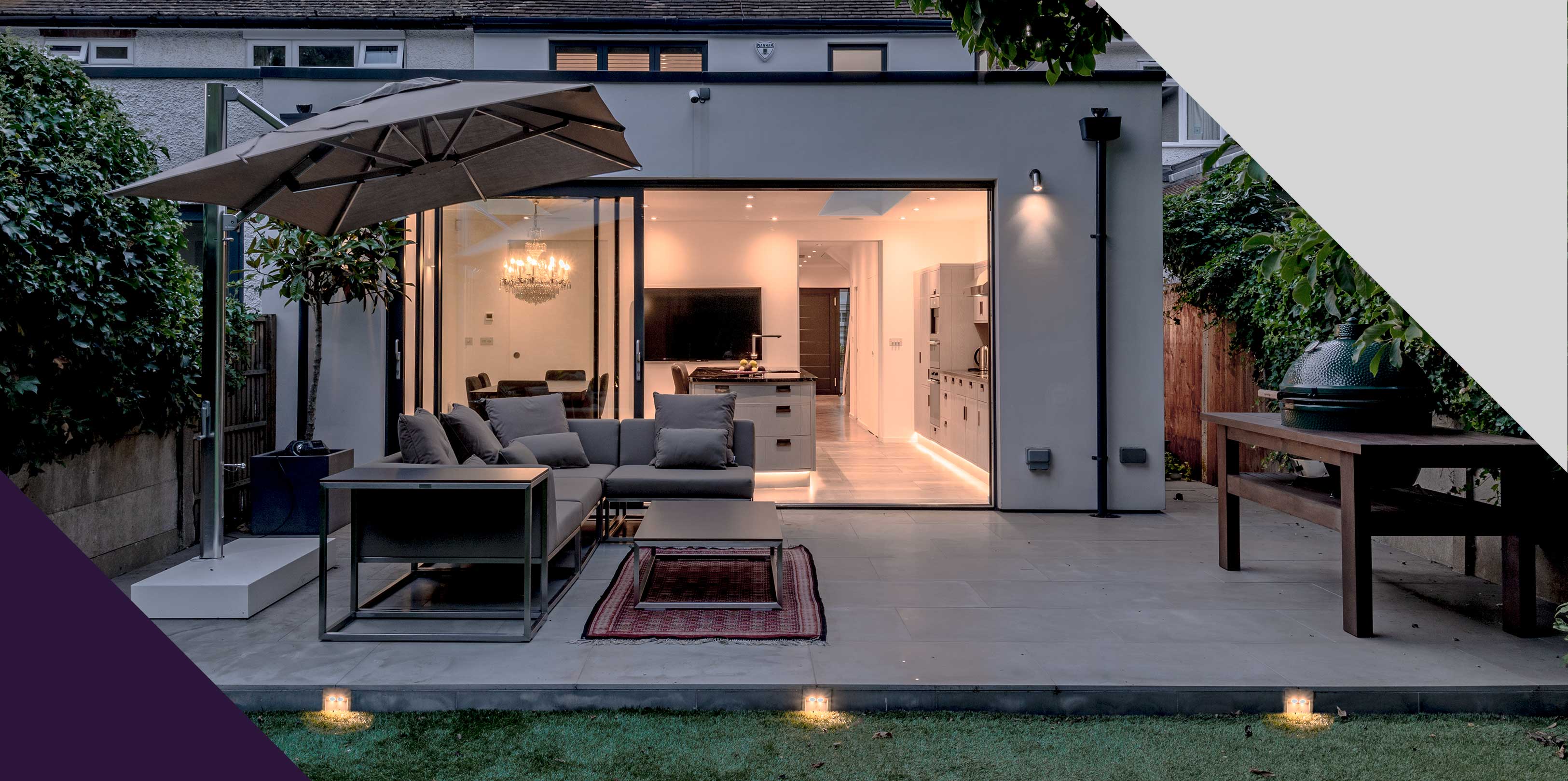
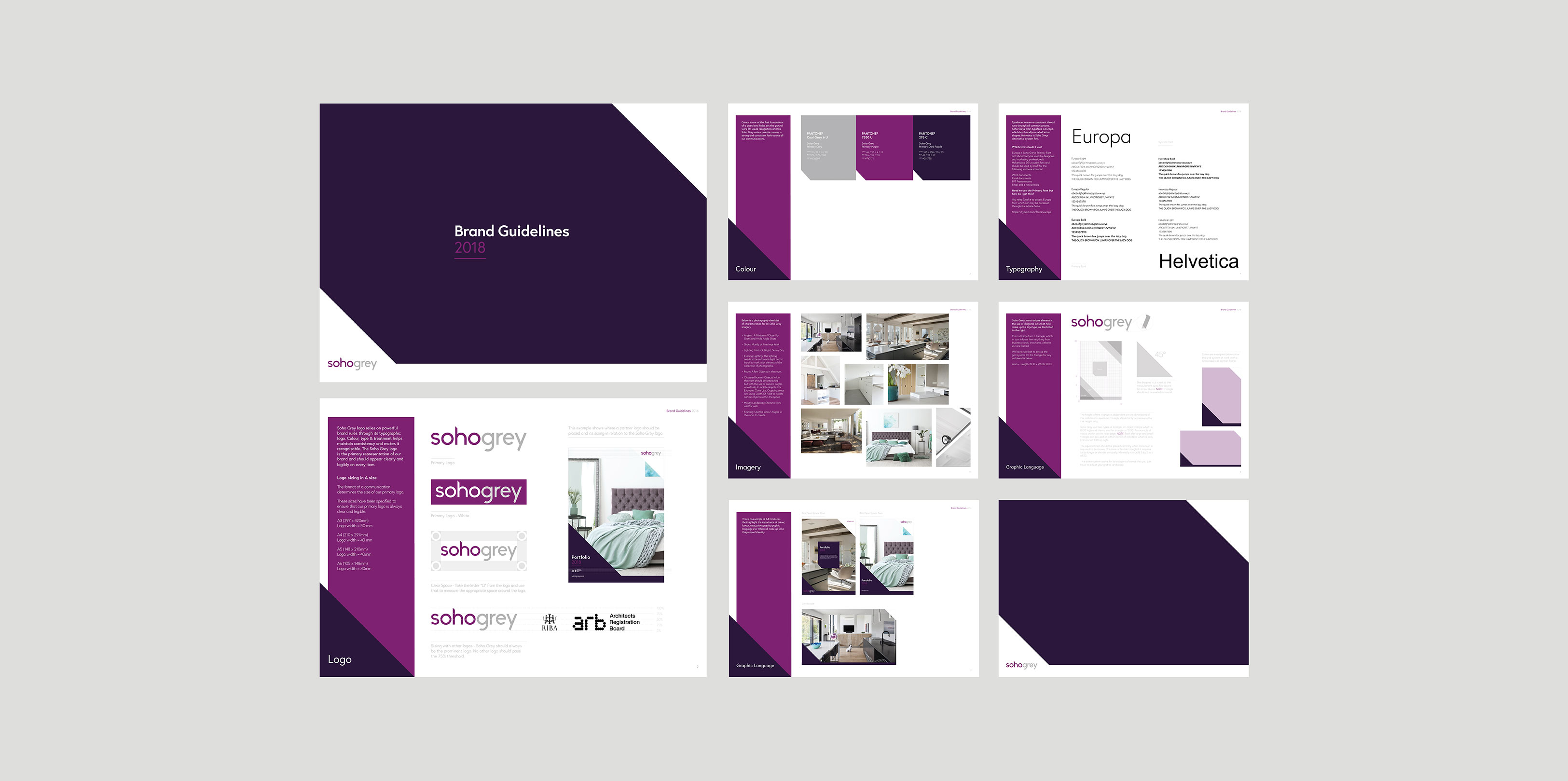
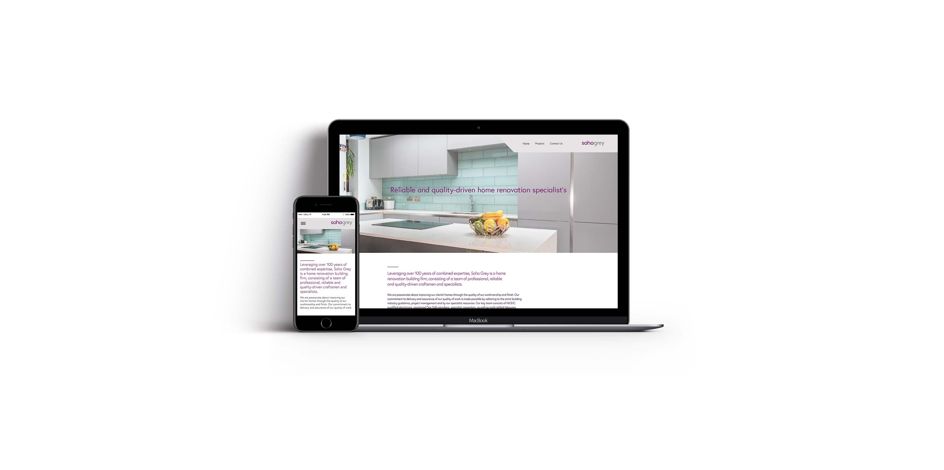
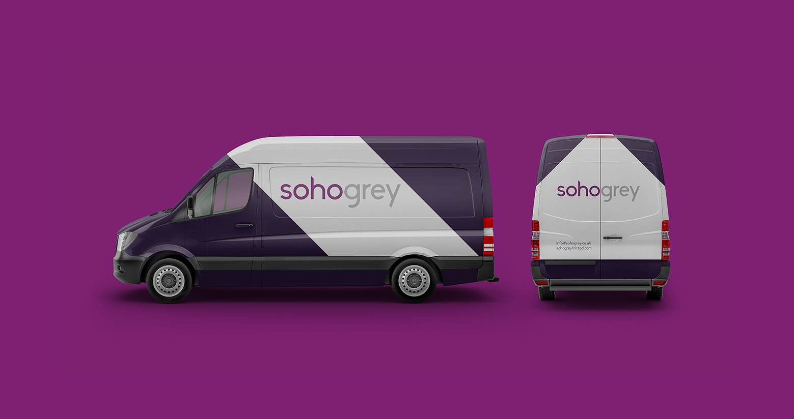
Starting with the logo, a sans-Serif font was chosen to make Soho’s logotype more contemporary. We introduced angular cuts to the logotype to subtly represent the angles used in the client’s designs. These angles were extended to be a core element to the brand for further collateral going forward. ClearBrand also commissioned a photographer to help show Soho Grey’s varied and modern take to modern home spaces.
See the website here: SohoGrey.co.uk
Results
The Results.
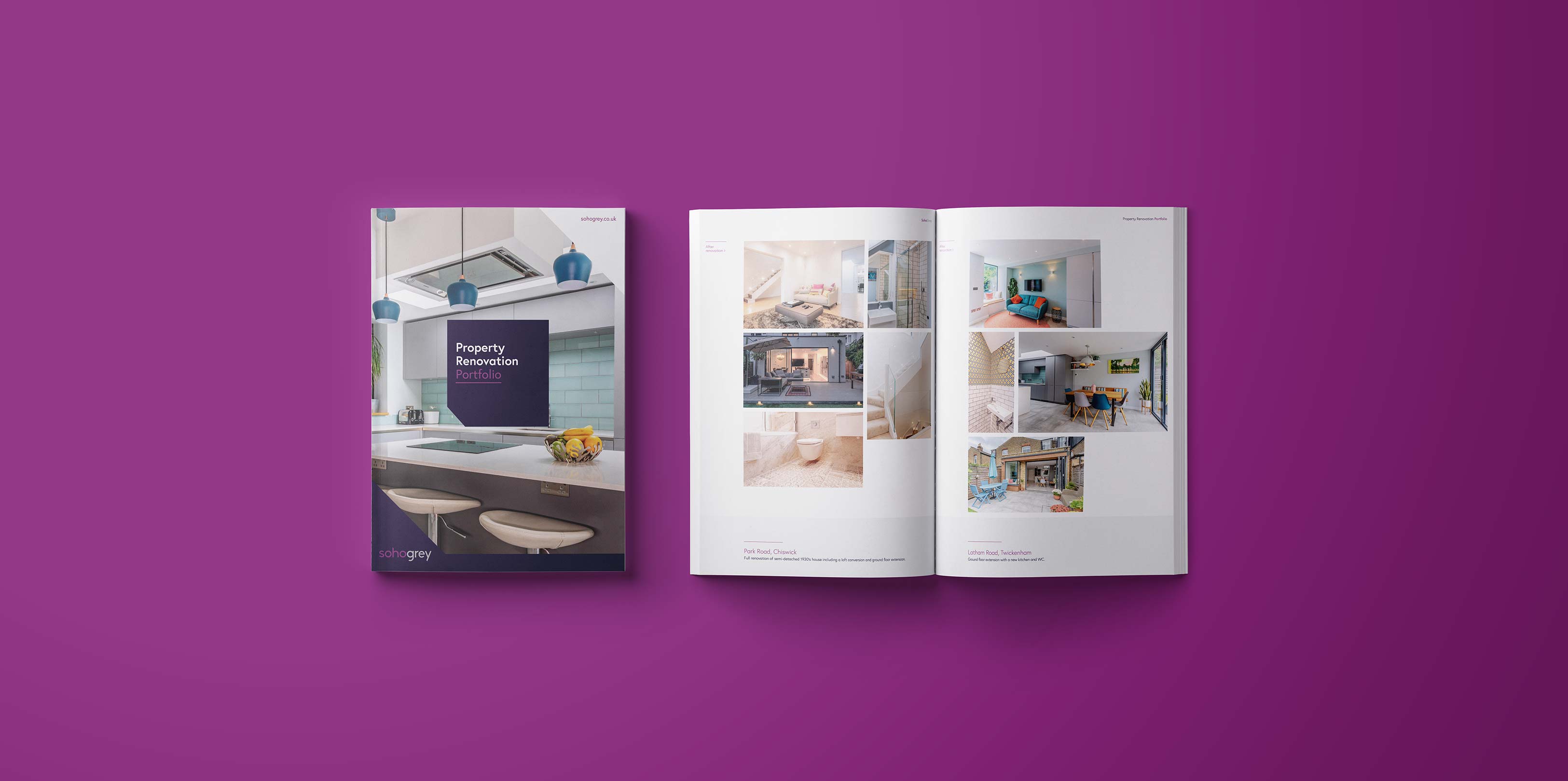
Soho Grey now has a consistent & contemporary identity that they can truly call their own. They have an online presence that showcases Soho Grey’s stunning properties, brand guidelines which will help the brand moving forward appropriately and print collateral that helps Soho attract new clients. Soho Grey now has a true representation through their brand of who they are and the services they provide.
See the website here: SohoGrey.co.uk