Reading Lettings
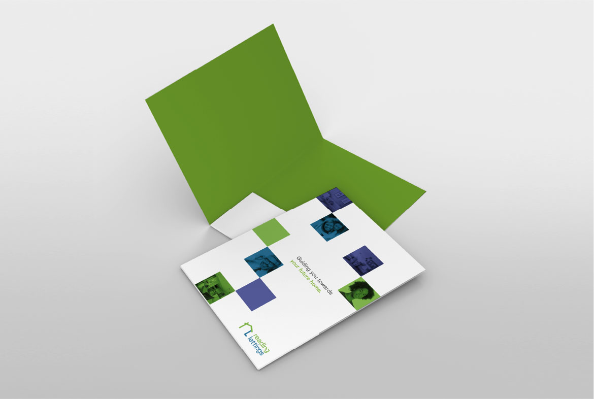
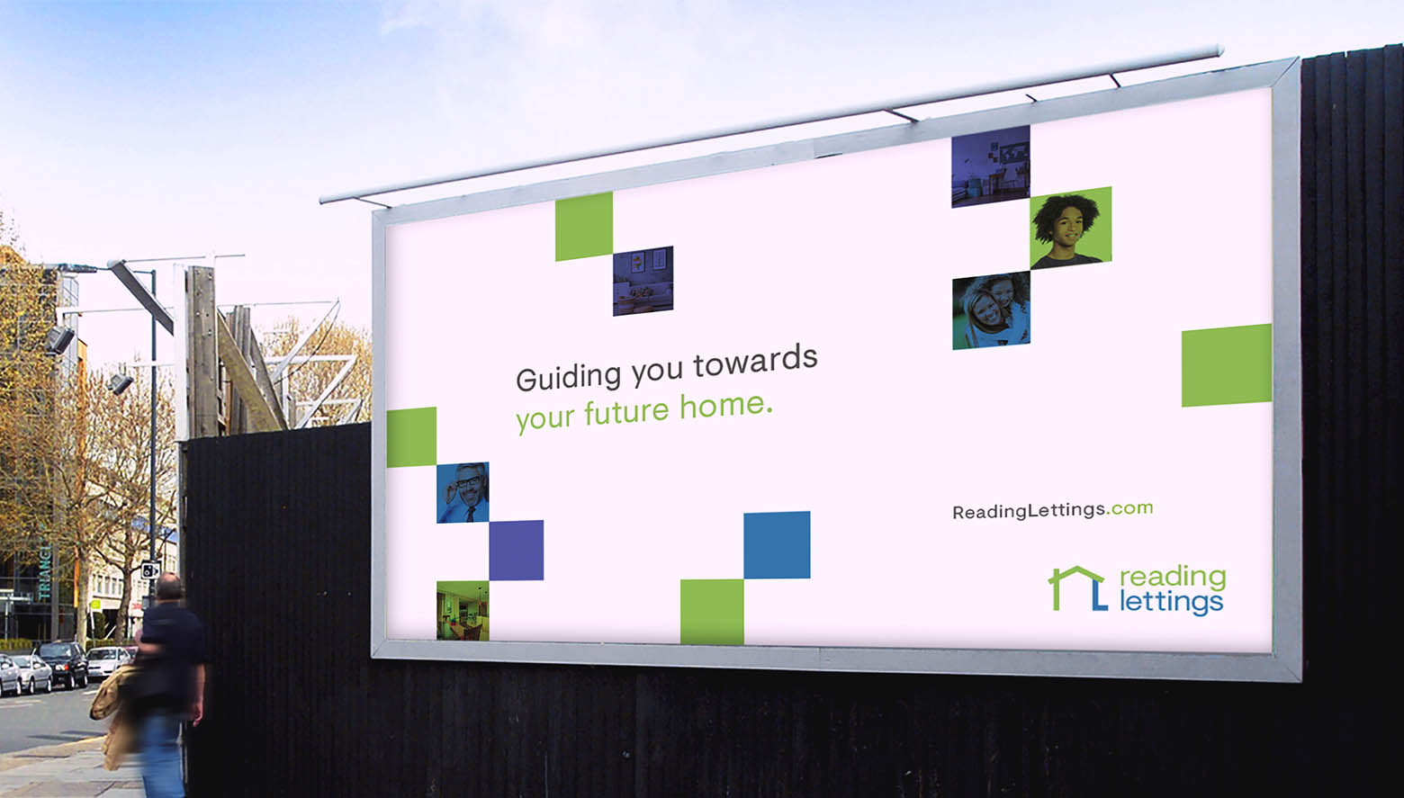
Guiding you towards
your future home.
A brand refresh for Reading’s leading letting and property management agency.
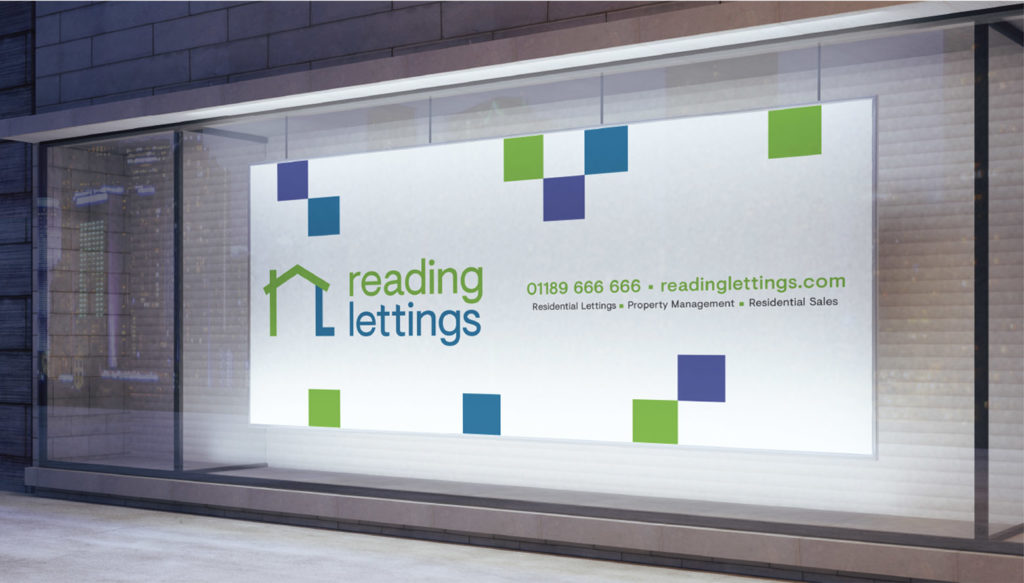
Banner
Brief
The Brief.
Reading lettings provide student and professional lettings, along with property management. They approached us wanting a brand refresh that would allow them to compete visually with the bigger players in the property market.


Solution
The Solution.
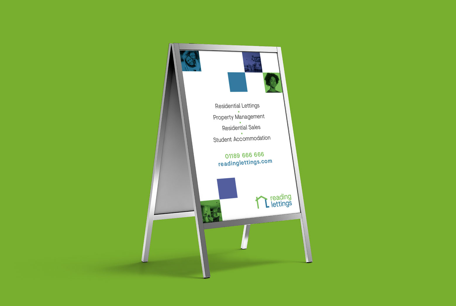
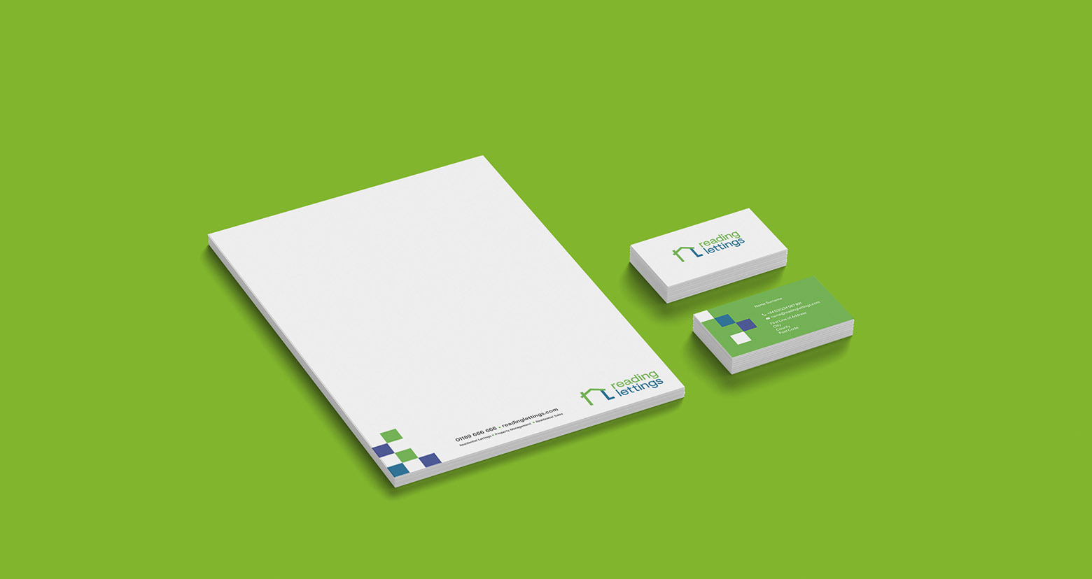
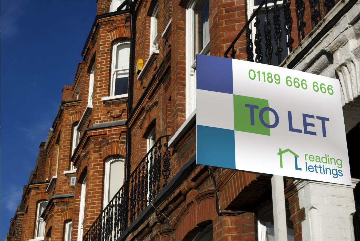
The mark itself combines the letters R and L to create a house symbol. ClearBrand created a flexible grid of images that shows the range of the different people and housing that Reading Lettings let and manage. We coupled this with a bold green and purple colour choice.
-
PANTONE®
360 U


Reading Lettings Primary Green
CMYK50/ 0 / 73 / 0
RGB134 /186 / 69
#86ba45
-
PANTONE®
7697 C


Reading Lettings Secondary Green
CMYK76/ 34 / 21 / 0
RGB58 / 142 / 155
#3a8e9b
-
PANTONE®
7668 C


Reading Lettings Purple
CMYK67/ 56 / 8 / 0
RGB102 / 117 / 170
#6675aa
Client testimonials
“My letting agency recently used ClearBrand for a new logo, stationery, fascia, etc. and they were excellent from start to finish. They offered a number of designs to choose from and made amendments promptly. Very happy with the final product.”
Adam Lewin – Director, Reading Lettings.
