-
Latest healthcare branding examples
In the dynamic healthcare market, effective visual elements play a crucial role in conveying messages of care and trust to patients. From typography choices to colour schemes, each design highlights ClearBrand’s ability to combine a visual narrative tailored to the unique brand values of each healthcare organisation. Explore the latest healthcare branding examples, the power of design in communicating brand values and how to make a positive contribution to patient healthcare below.
Omega Diagnostics: brand narrative and rebrand
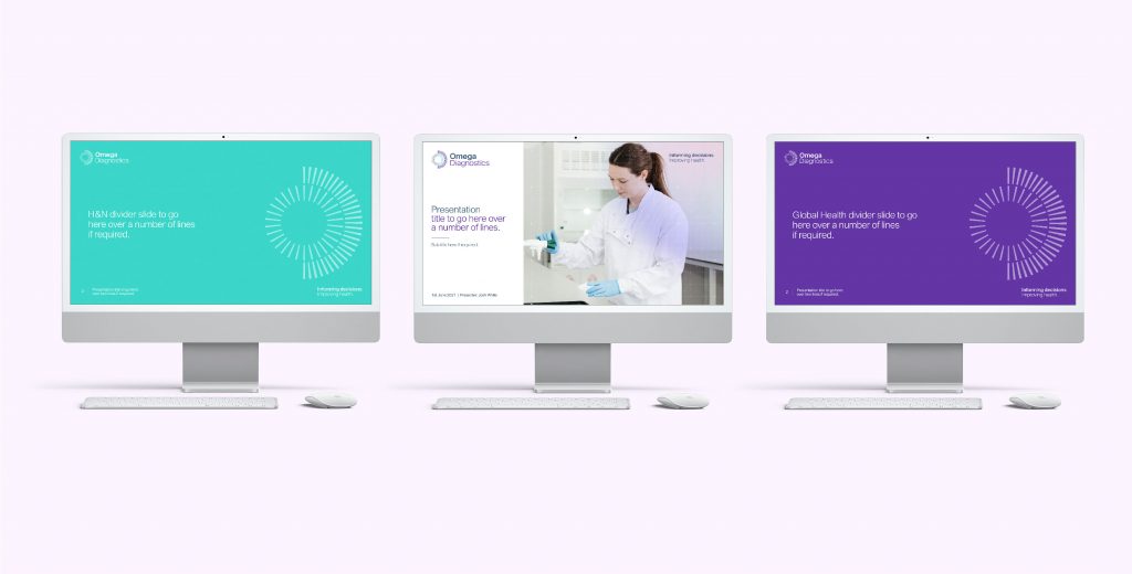
ClearBrand partnered with Omega Diagnostics to develop a contemporary corporate identity that mirrors the organisation’s character and dedication to a message of being ‘progressive, dynamic, and approachable.’ The logo represents, a blend of the letters ‘O’ and ‘D’ with a radar-inspired visual approach representing the ‘quest for answers,’ capturing simplicity and functionality. This minimalist design enables Omega Diagnostics to effectively convey their message. In healthcare branding, colour plays a crucial role, and Omega Diagnostics chose a vibrant green and purple to enhance the association with health and vitality.
One Medical: modern healthcare branding
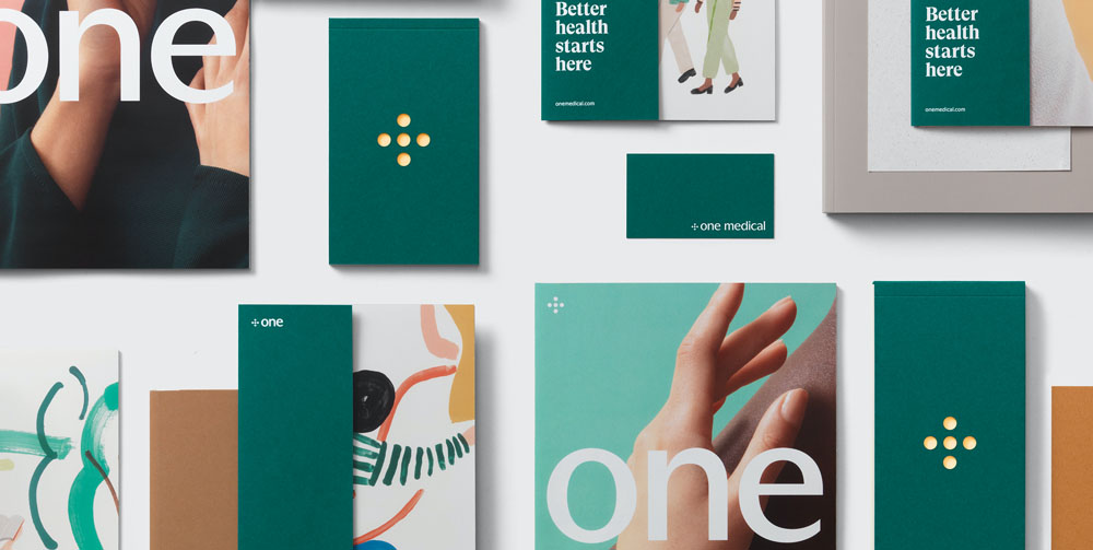
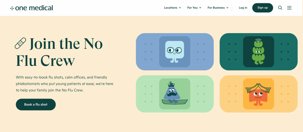
One Medical’s brand is centered around delivering individualised healthcare that prioritises the requirements of the patient. Their brand has been designed completely differently to traditional healthcare branding examples seen previously. One Medical use modern aesthetics such as an inviting green colour invoking a sense of trust and comfortability in users. As well as using playful illustrations particularly within the ‘For Kids’ section, suggesting that they have considered their audience thoroughly and using minimalistic design to accurately communicate information to prospective clients.
Parkinson’s Europe: historical healthcare rebrand
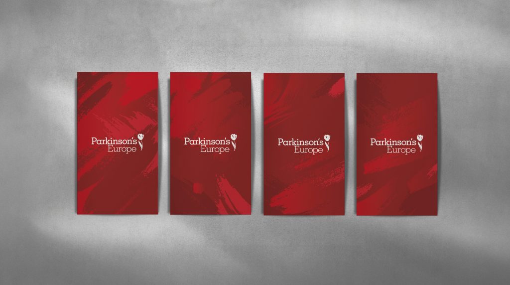
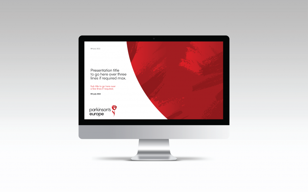
As the foremost advocate for Parkinson’s in Europe, Parkinson’s Europe envisions granting individuals with Parkinson’s disease access to the highest standards of treatment and care for a fulfilling life. ClearBrand facilitated a name change and rebranding effort, encompassing elements such as email signatures, business letters, and a PowerPoint template. The logo, featuring a hand-painted tulip, symbolizes the creativity often associated with those affected by Parkinson’s disease. The handmade aspect of the logo fosters a stronger personal connection between the brand and the consumer, a crucial factor in an industry that places value on a sense of personal care.
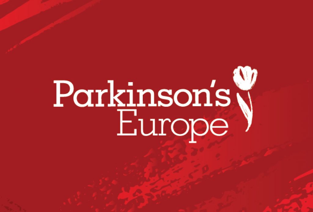
The colour red, symbolising strength and determination, is paired with a serif font in the painted posters, reflecting tradition whilst reinforcing the brand’s historical values. This healthcare branding example places importance on artistic expression, instilling confidence and assuring patients they are in capable and caring hands.
Alan: unique healthcare plans
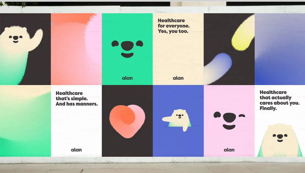
Another of ClearBrand’s latest healthcare branding examples is Alan , a healthcare company that is focused around ‘better living’. Alan has created a system that flows around the individual, using empathy to develop its product: a contrast to the clinical world of health insurance. In the past few months, several brands have diverted from the corporate approach in favour of more colourful and cheerful identities. This is whatDesignStudio have facilitated, using the character of a fluffy bear to help the start-up connect with consumers. This healthcare branding example stands out and conveys a warmer personality that will catch the attention of users allowing Alan to stand out in the healthcare marketplace.
Doctors Association UK: Medical advocacy group rebrand
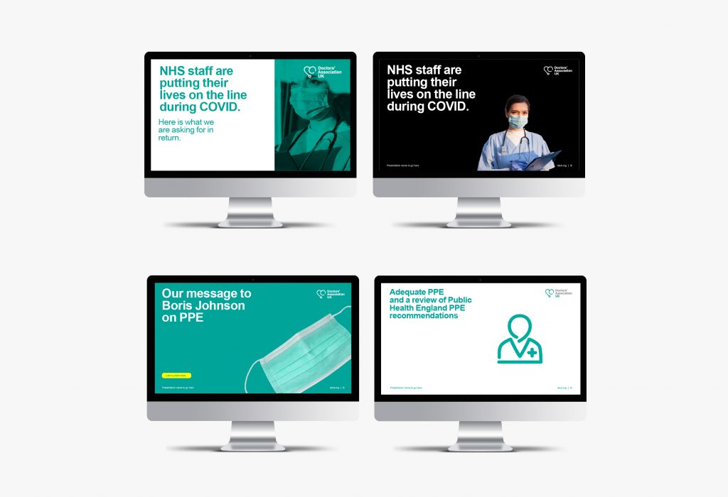
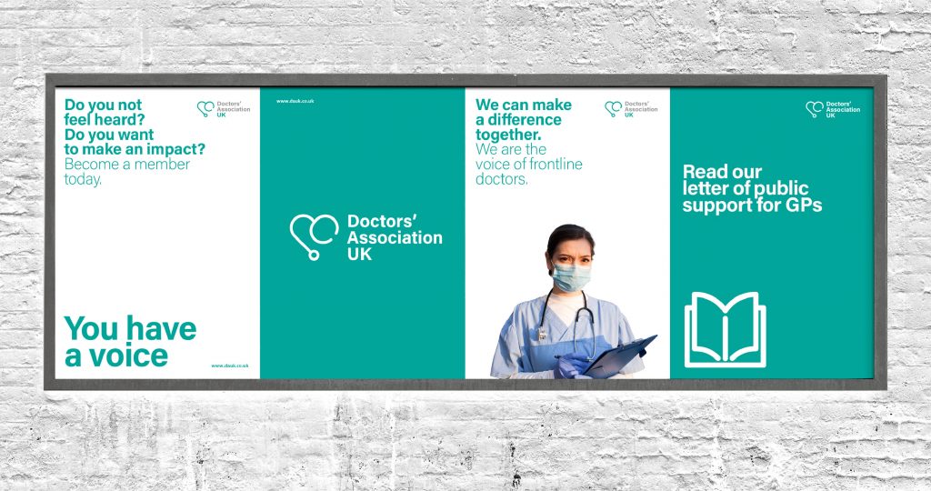
As a non-profit association and advocacy group representing the UK medical profession, Doctors Association UK (DAUK) is guided by dedicated volunteer doctors who actively sought a professional platform for engaging with media outlets and politicians. ClearBrand maintained the recognisable green from their previous branding and introducing a bold, sans serif font to prominently convey the brand’s clear message. The logo, a combination of a stethoscope and a heart, highlights their caring and empathetic stance.
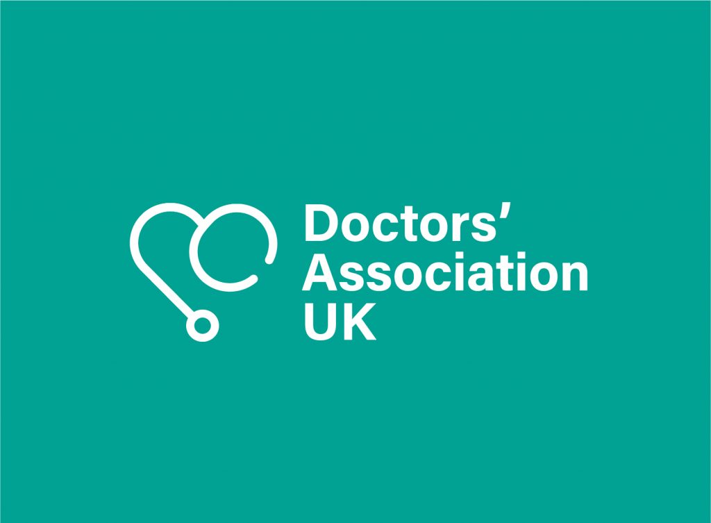
Consistency across touchpoints, including social media templates, photography sets, stationery and email campaigns, ensures customers are the top priority for DAUK which they can recognise, setting their brand apart from competitors.
X-Lab: cohesion of two sub-brands
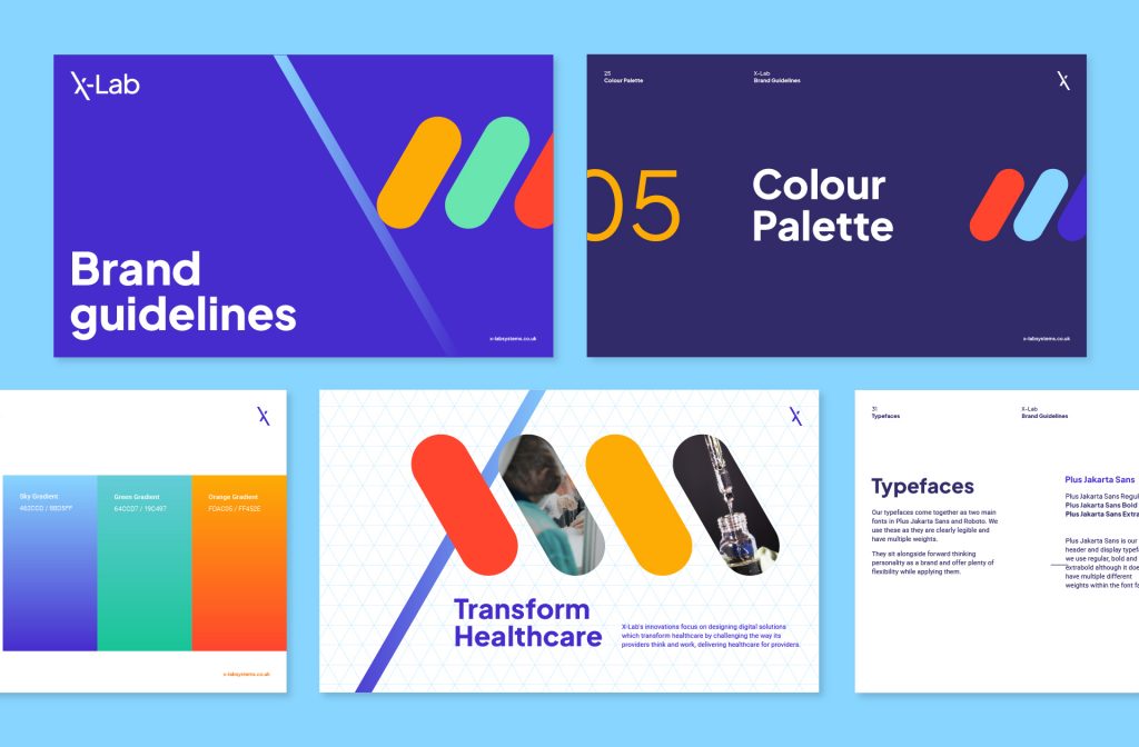
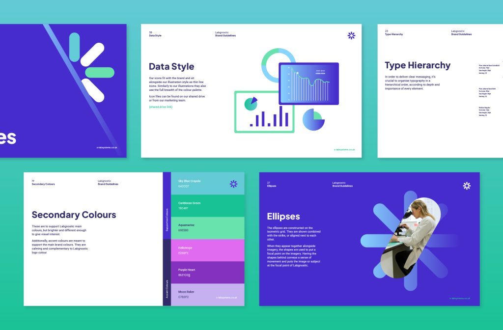
As pioneers in the healthcare industry, X-Lab aimed to prioritise people, creating a brand that emphasised the benefits whilst maintaining a human and approachable essence. Initially, X-Lab operated under two separate identities, X-Lab and Labgnostic. Canny Creative had the challenge of aligning both brands whilst creating two distinct identities. X-Lab introduced lively, playful illustrations, people-centric photography and benefit-oriented copy. The website copy, guided by X-Lab’s commitment to enhancing outcomes for both professionals and patients, emphasises specific benefits. This approach simplifies the user’s decision-making process, helping them determine if X-Lab aligns with their needs.
Exploring the showcased healthcare branding examples presents a variety of design examples where each visual identity surpasses aesthetics, focusing on the core values of care, compassion and professionalism within the healthcare industry. Better communication means better care, whether you seek inspiration or have design needs of your own in the healthcare sector, reach out to us using the information below. We’re here to bring your vision to life.
–
The article was written by ClearBrand, November 2023.
To get in contact about working with ClearBrand on a project,
please call +44 (0)118 405 0255 or email info@clearbrand.co.uk.Published on: November 24, 2023
